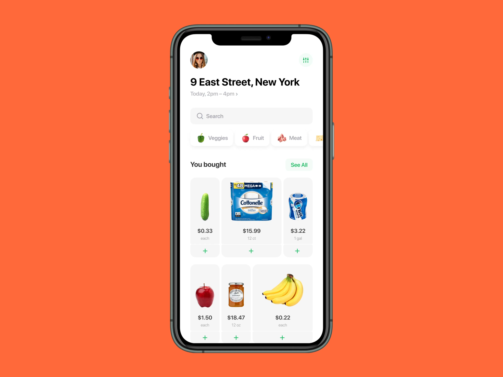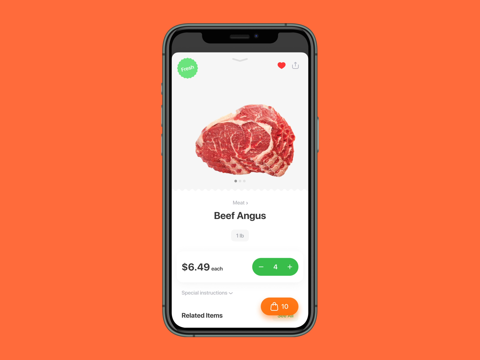


Open an app like you open a door of your fridge!
We are challenged to make online grocery shopping as faster as it is possible because we see digital as a barrier too.
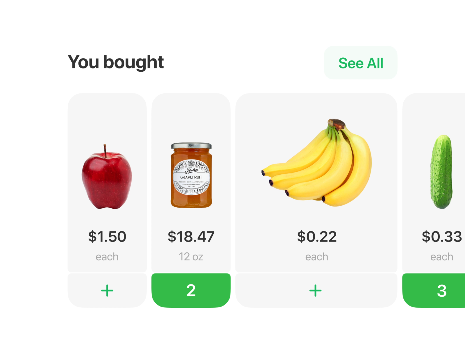
Beginning with a comparison of a mobile phone’s screen with a shelf in a store, we tried to imitate a way of how people collect groceries. It’s easy to find goods when you have a big picture in front of you, isn’t it? So how to recreate it on a small screen?
Looking at a shelf, we noticed that goods are closer to each other, large size stands out, and we firstly pay attention to a package instead of a tag with a price on it.
What insights of buying experience do you have? Share with us in the comments below!
Get in touch with us, we are available —
hello@madebymad.co
做人要厚道,转载请注明文章来源:
https://www.boxui.com/ued/ui-design-ued/36726.html


评论回复