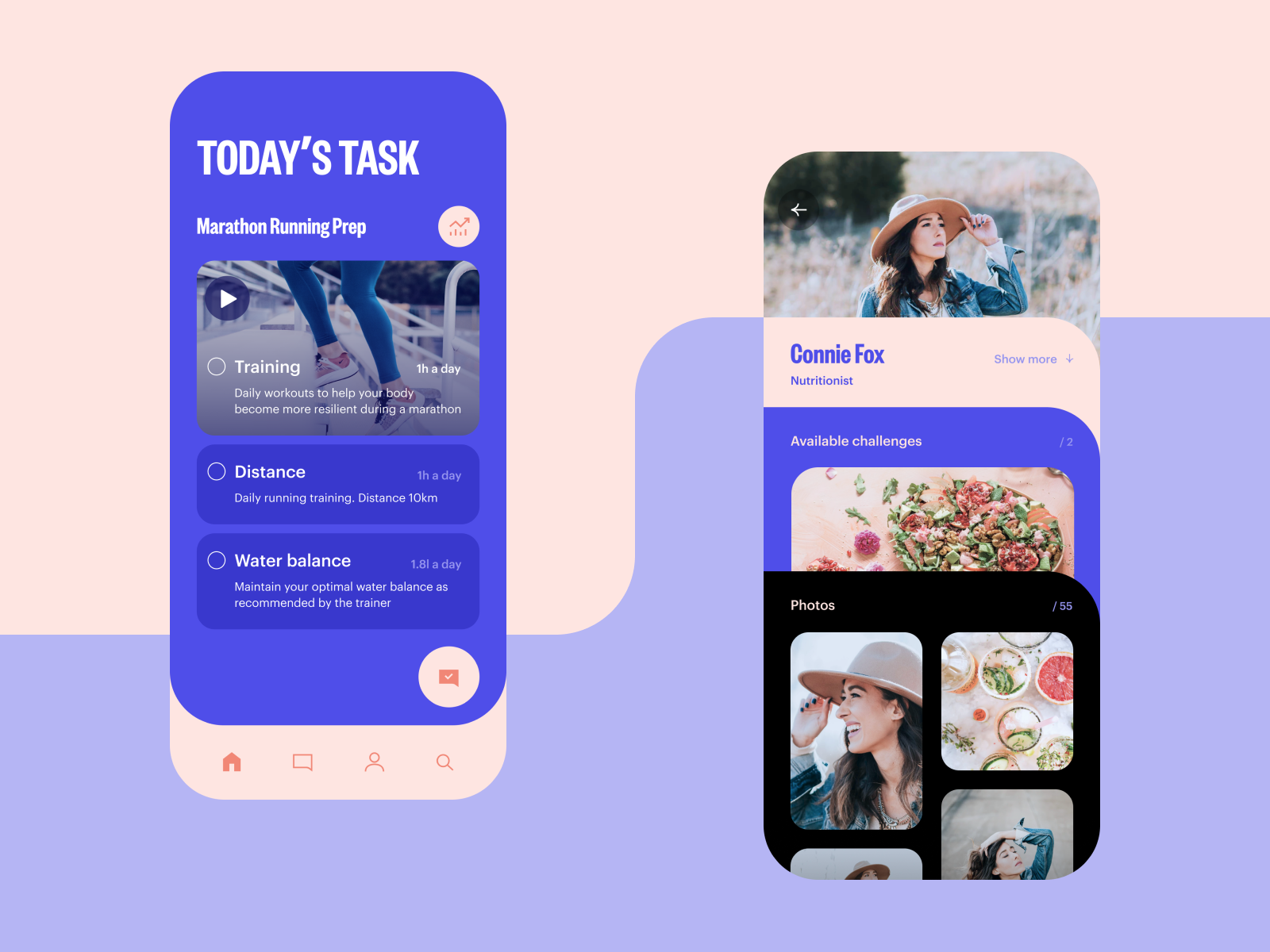
For many people, one of the great benefits of the modern technological world is getting access to various challenges that can be done remotely and supported by coaches from different corners of the world. Today, we would like to show you another piece of the design devoted right to that theme. Here’s a couple of screens for a mobile application helping people take challenges online and boost their skills, knowledge, health, and fitness. It’s easy to see that elegance, readability and usability were top priorities in design process. Here you can see the screen of the current challenge with the to-do list and the screen of a coach’s profile. Stay tuned to see more on the project!
Also, welcome to check the review of images in web interfaces, learn how to design search interactions, and review some practices on UX design for preventing errors in user interfaces.
Tubik | Behance | Instagram | Twitter | Facebook
>>访问dribbble查看高清大图


评论回复