

The team is available for new projects! Drop us a line: hello@purrweb.com | WhatsApp | Website
Hey! Do you believe that any banking app is to be serious and dull? What do you think about this style?
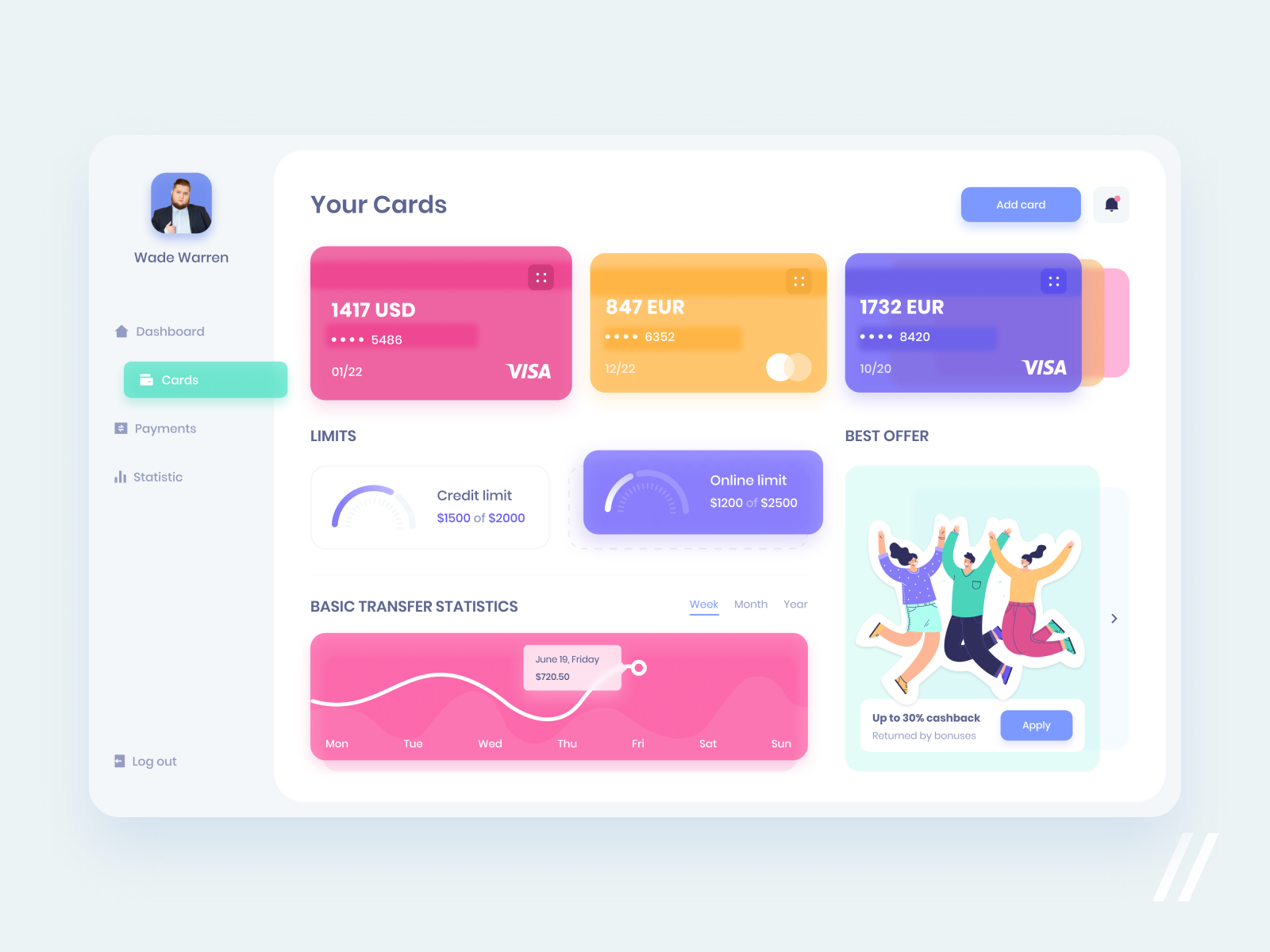
Check out our new design for a baking app. It allows the user to monitor all deposits and transactions on a card, transfer and borrow money, and whatever people usually do in these apps.
💵 What do you see on the shot? It’s a screen with the user’s cards. Once they tap on one of the cards — they’ll know card limit or balance and short transaction statistics.
💳 What is special about it? You can find many state-of-the-art ideas for a bank card design floating around Dribbble or Behance. They are mostly translucent, which is really stylish. This app is perfect for a bank using such cards, and we wanted to convey this style in the app.
💰 The core elements of the app look like semi-transparent colored cards (just like cards from a real bank). The same style is applied to the main sections. The background is designed neutral on purpose, to emphasize units.
Created by Julia Tikhiy-Tishchenko
Press L if you like this design and
Share feedback in the comments!


评论回复