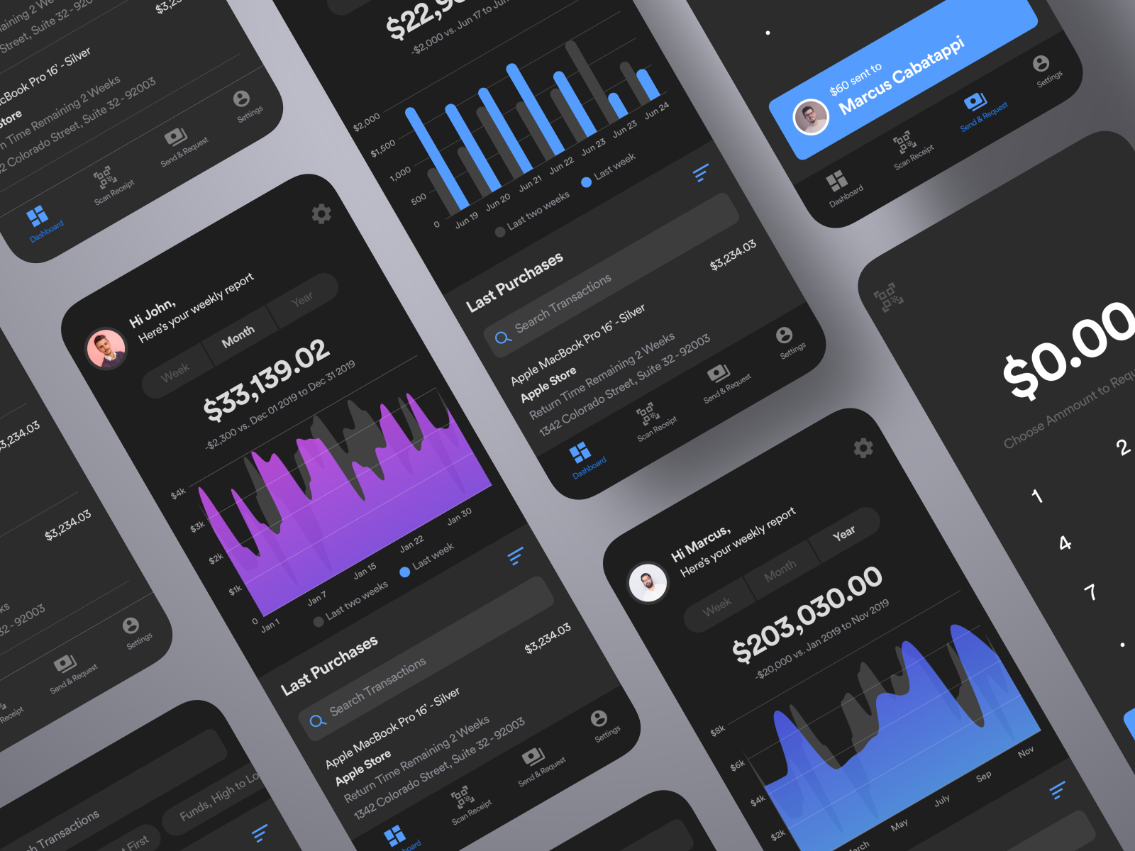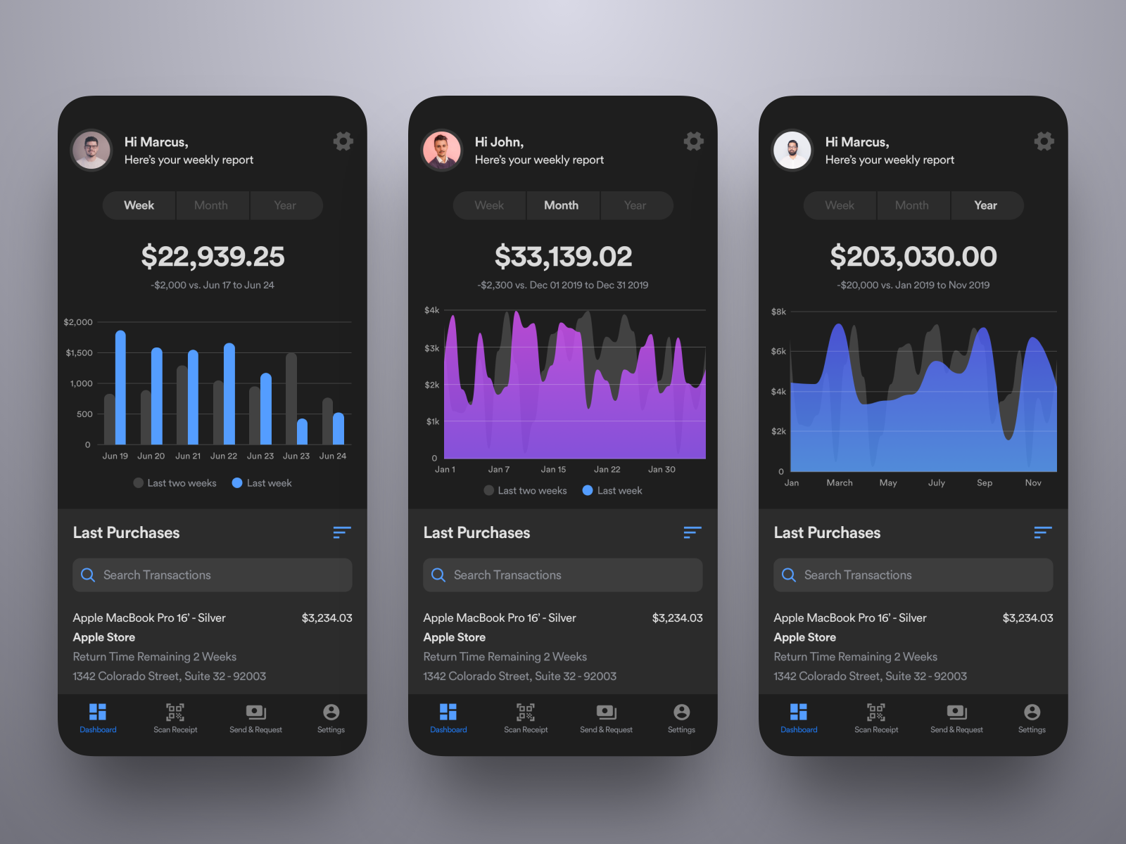

Hi all, sharing different states for the main dashboard screen for this wallet app. The charts are divided in to three main data points: weekly, monthly, and yearly. The goal is to help the user get a quick glimpse of their spending summary.
Hit “L” or like to show some love ❤️
YesYou is a product design studio that helps digital brands grow with experiences people love.
Website 👉 yesyou.studio
Work inquiries 👉 isaac@yesyou.studio
Instagram 👉 instagram.com/yesyoustudio
Behance 👉 behance.net/yesyou
做人要厚道,转载请注明文章来源:
https://www.boxui.com/ued/ui-design-ued/37929.html


评论回复