

The team is available for new projects! Drop us a line: hello@purrweb.com | WhatsApp | Website
What’s up, guys? We’ve got a new shot for a bicycle rental app.
What do you think about it? Looking good or not?
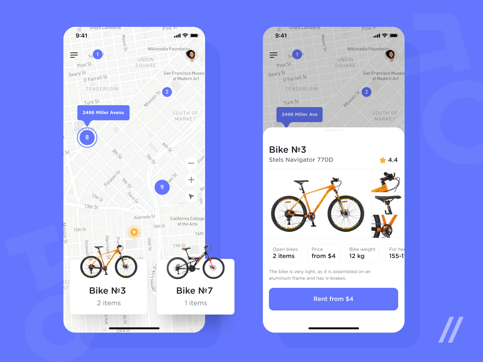
🚲 What do you see? On the left side, you see all centers where you can rent a bicycle. The numbers mean available units. Tap on any of the centers and you’ll see a panel popping out from the bottom that contains information about all accessible bicycle models (along with the number of them). Tap on a card and you’ll see a detailed description of the selected model, characteristics, rating, photos, and the Rent button.
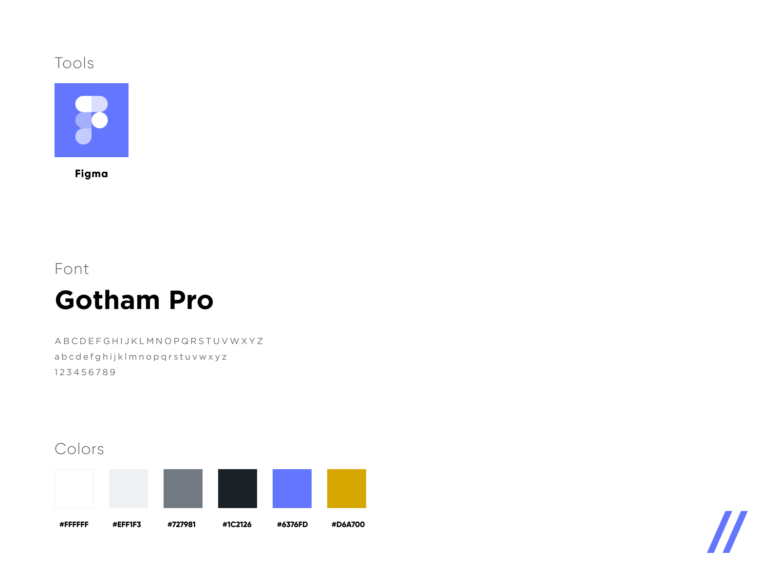
🌎 Bicycle is an environmentally sound mode of transport. That’s why we chose royal blue as a primary color — it stands for the ecology. In addition, royal blue (as well as red, blue, and green) is one of the brightest colors, which makes it a color to be used carefully. The second main color is orange. They create color contrast and work well with the minimalistic interface.
🚴🏻♀️ The easier, the better! The app is a snap. You choose a center, you choose a bicycle model and rent it.
Created by David Budnik
Press L if you like this design and share feedback!
>>访问dribbble查看高清大图


评论回复