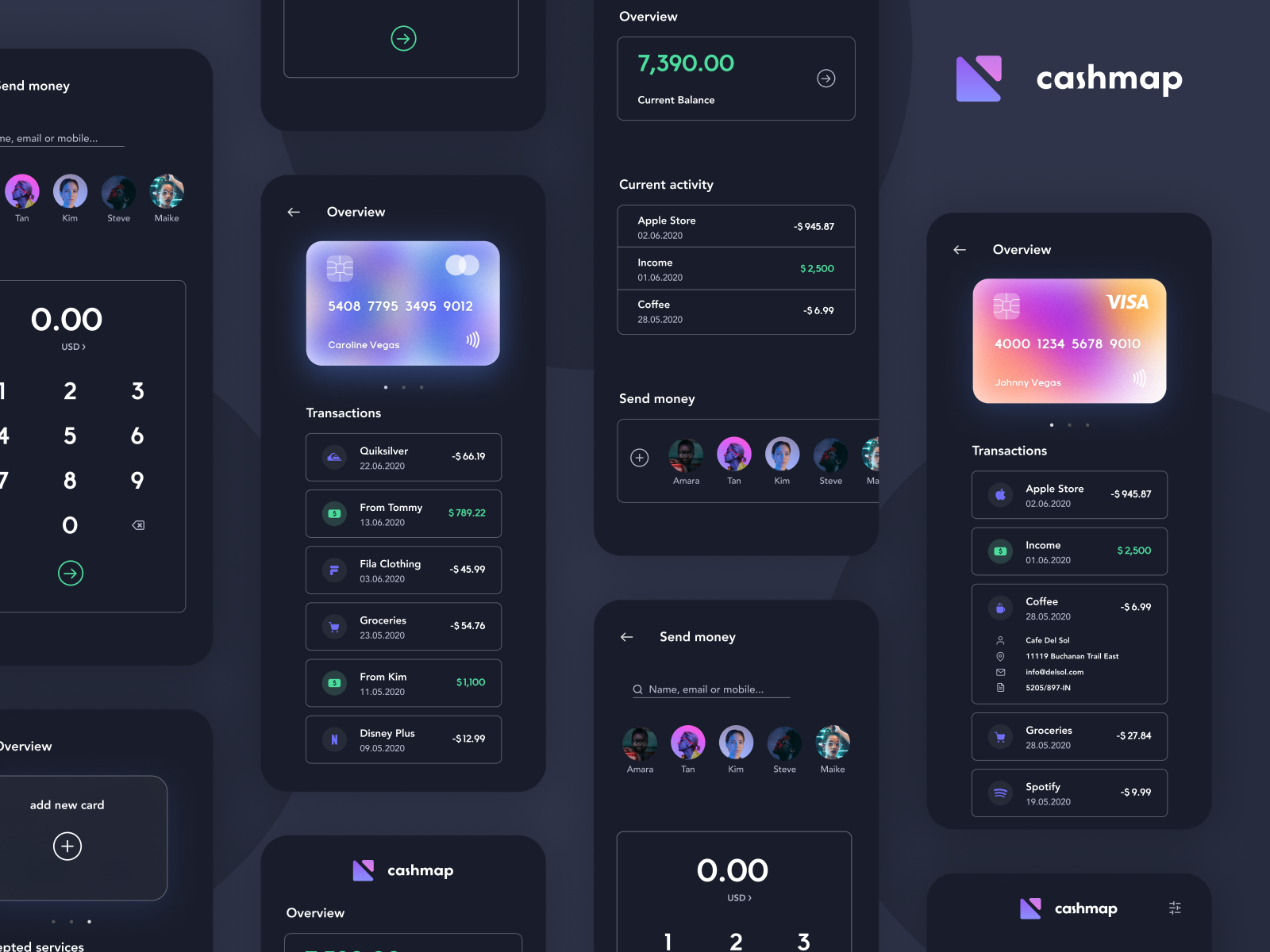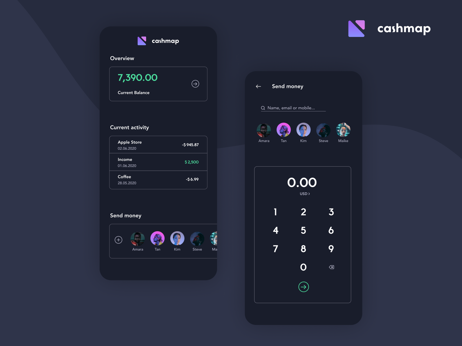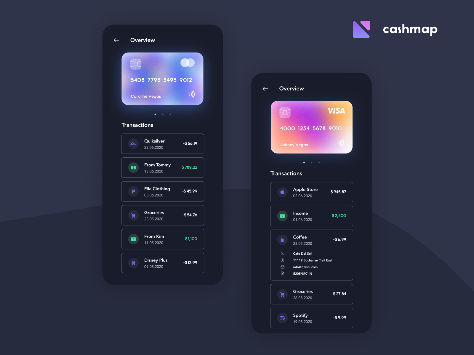


Some app screens from an app that works as a digital wallet for credit cards and bank accounts. This is the dark mode for that app. Some minor adjustments to the lightmode were made. For example the switch from drop shadows to outlines, since they work way better in dark mode.
Let me know what y’all think about this one!
>>访问dribbble查看高清大图
做人要厚道,转载请注明文章来源:
https://www.boxui.com/ued/ui-design-ued/37980.html


评论回复