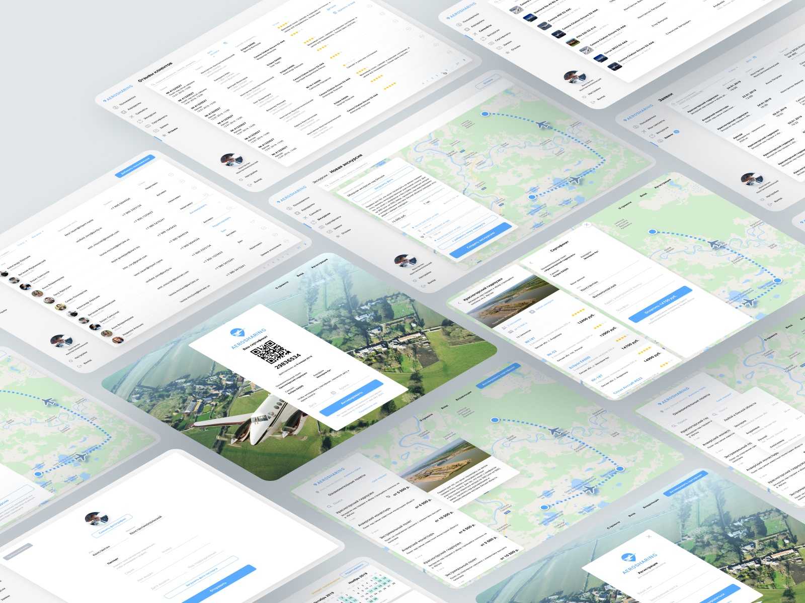
Our design concept of a sightseeing flight booking service. Sounds interesting? Fasten your seatbelt and keep reading!
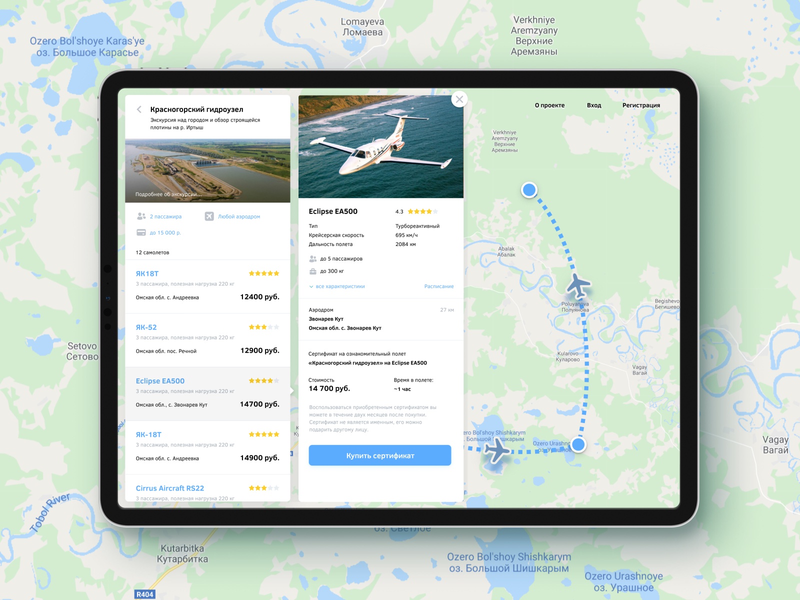
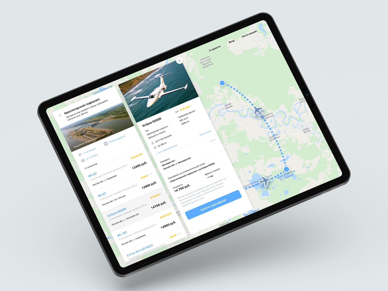
The first slide takes us to an aircraft selection screen where users can read about each of them and see feedback. All steps of choosing a flight and an aircraft are on one screen with a map showing a chosen route.
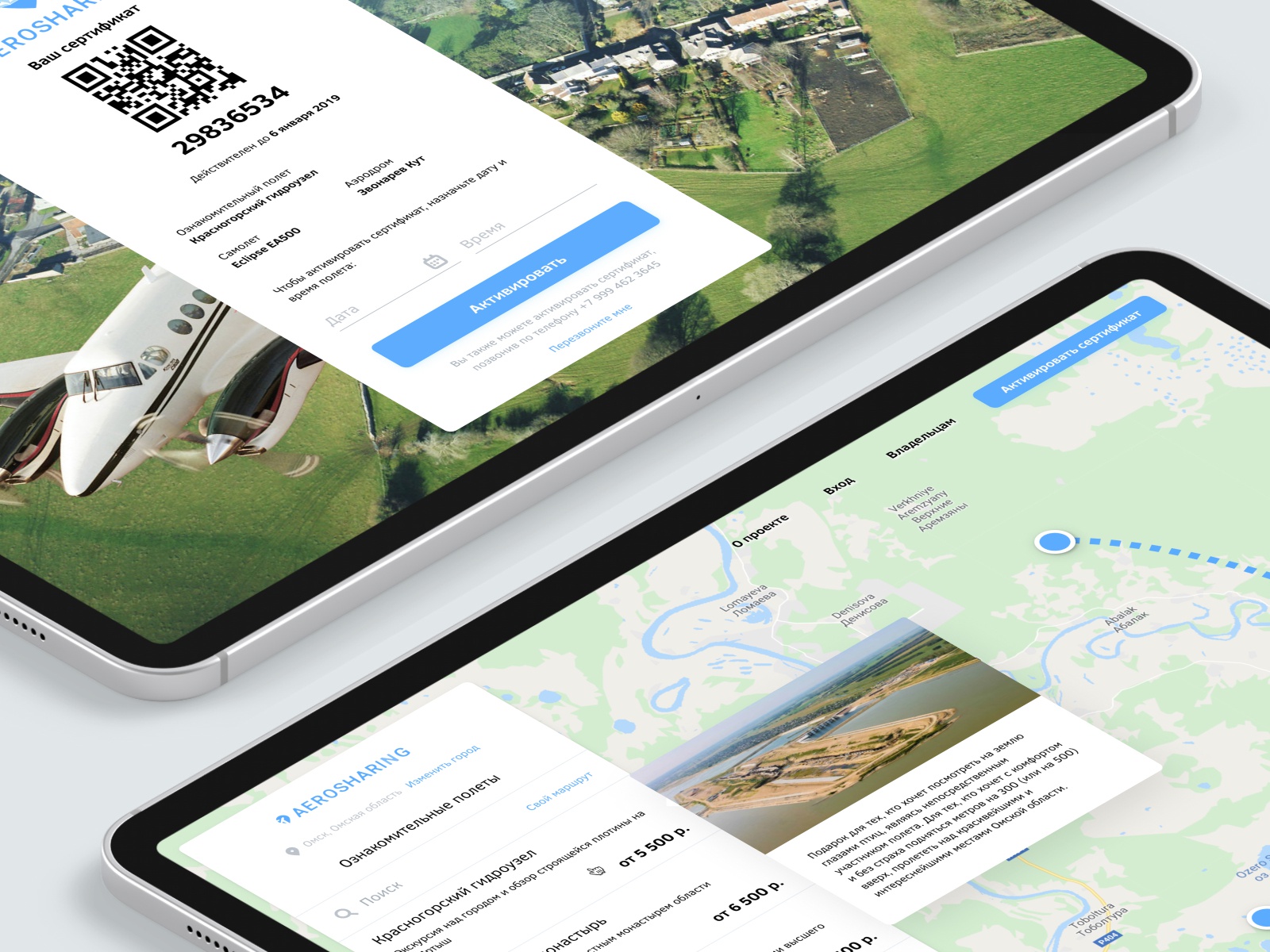
The second slide features two screens. The one on the top is a screen with a QR code of a bought flight certificate, below there’s a screen with information about the flight. A user just needs to show a QR code to get on an aircraft and enjoy a flight. QR code scanning confirms that an owner of the aircraft, in fact, met the passengers and took them for a tour. Also, QR codes make it super simple to give such a flight as a gift.
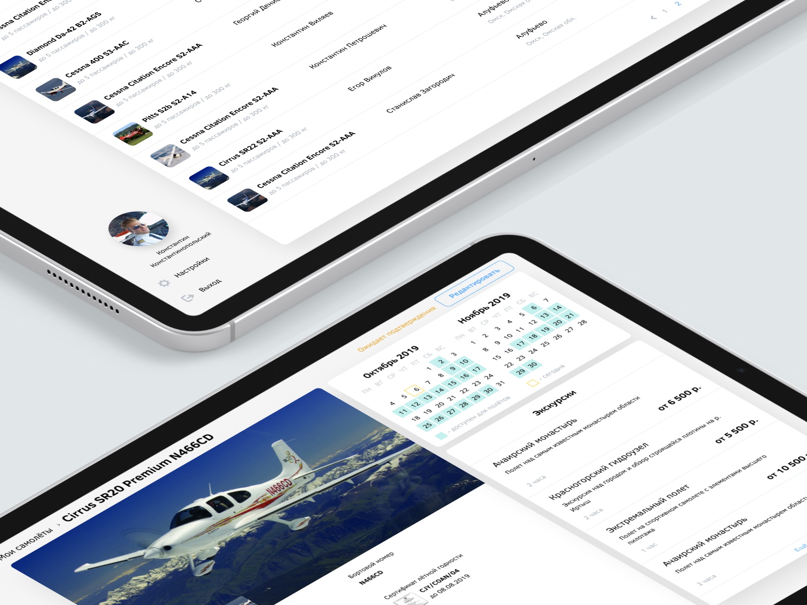
The admin panel is on the third slide. There are two main screens – a list of aircrafts and each aircraft’s availability and its sightseeing tours settings.
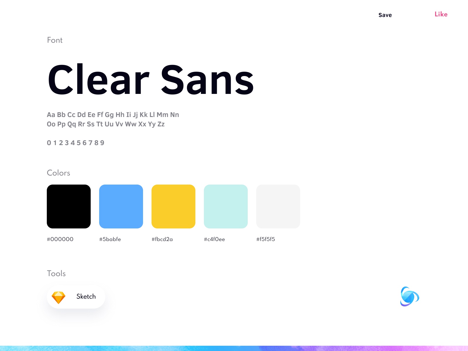
The color palette of the interface is neutral with bright UI controls that immediately attract
user’s attention.
Would you book a flight?
💌 Our team is always up for new projects! Drop us a line info@ronasit.com | Telegram | Facebook | Linkedin | Website
>>访问dribbble查看高清大图


评论回复