
Hey, hey!
Just spilled coffee on my laptop, so the challenge is just in time! ☕
Since the assignment was about the everyday life UI, I decided to show it through the eyes of my personal coach: a lot of boring things and forms. Also everywhere I tried to use the ProtoPie approach (independent components that send messages to the scene on triggers. So the host scene works mostly with the received messages).
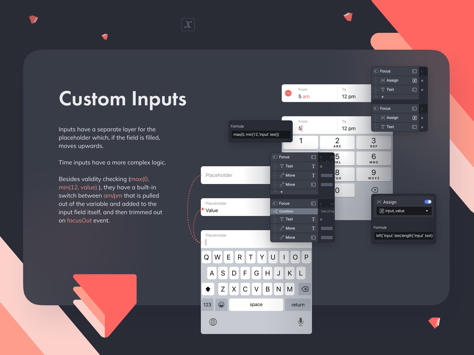
Inputs have a separate layer for the placeholder which, if the field is filled, moves upwards. The date and time inputs have a more complex logic: apart from checking for validity, they have a built-in switch between am/pm that is pulled out of the variable and added to the input field itself, and then trimmed out on focusOut event.
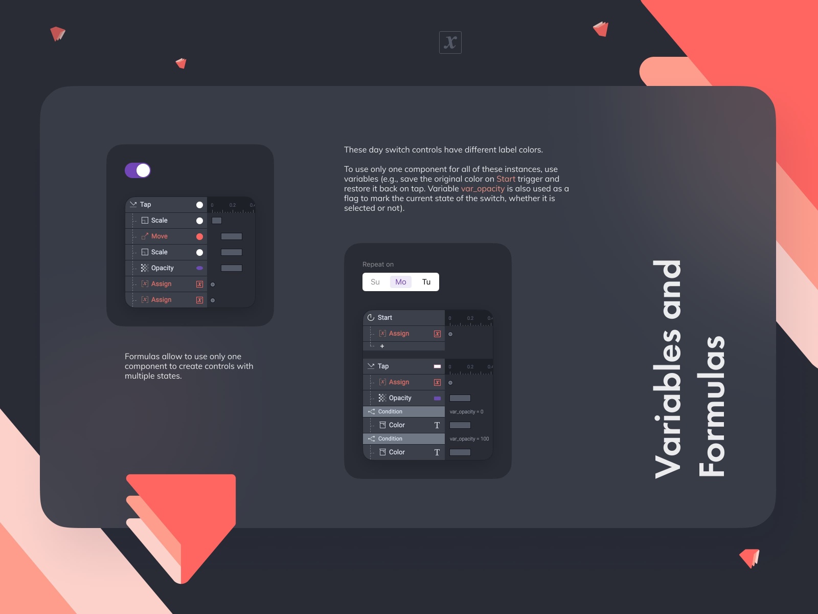
I also tried to practice and use variables and formulas to be able to use only one component for different instances. For example, switch-instances for days have different unselected label colors (“su” is gray, “mo” is black), but they use the same component that stores the original color in a variable and restores it on triggers. Same with the weekly pager. The whole logic is built on the component with a day item, which, based on the received message, is either select or unselect itself (it allows to automatically toggle all instances). And with variables it was possible to pass selected date to the title in navbar.
Anyway, I was happy to try #ProtoPie5.0. I missed an opportunity to connect real data from table source and generate components automatically (for lists and content) based on it. It would also be great to support the transitions that are now used by default in iOS for modal windows.
By the way, to maintain authenticity, the final video was also made in ProtoPie 🍰, so no AE was used here :).
App:
https://cloud.protopie.io/p/990a540816
Video Shot:
https://cloud.protopie.io/p/7d8df3df1d
Thank you for pressing ‘L’ . 🥰
>>访问dribbble查看高清大图


评论回复