

The team is available for new projects! Drop us a line: hello@purrweb.com | WhatsApp | Website
Hi, friends! What do you think about the style? Can a finance app be this cheerful?
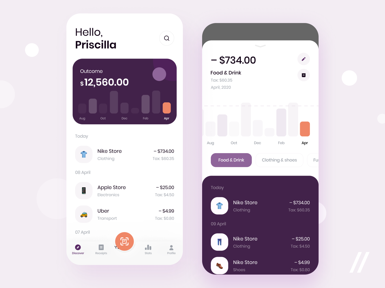
📊 The first shot — it’s a home screen. Here users can see overall spending for a month and purchase and transaction history. There is also spending search and a big orange button that lets them scan a check (hence get information stored automatically).
The second shot — it’s a screen showing detailed information about the purchase. Users can edit it (for example, change the category, rename or alter the amount), see a check itself, or look at all purchases made in the store.
🗓 We chose a cheerful color palette because we like to stand out from many serious banking apps and finance trackers.
As we didn’t want to load the user’s device, we decided to use emojis to represent categories. Users can create their own and choose for each up to 3 emojis.
Created by Ilia Utkin
Feedback helps us improve and grow,
We’re keen to hear your thoughts! ❤️


评论回复