Hello Dribbble
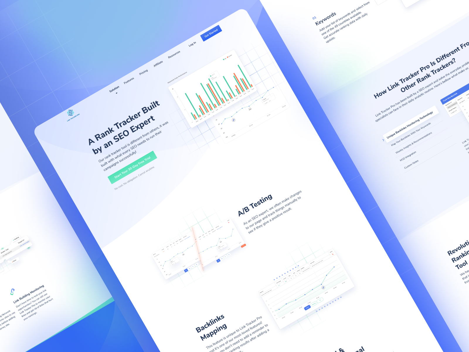
Sharing a sneakpeek website redesign we did for LinkTracker Pro.
Pain Point :
1. Lack of stability in every design element that persuades the audience to understand the information displayed.
2. The use of illustrations in conveying information or content is unclear and less communicative.
Solution :
1. Showing the proper use of hierarchy in graphic elements, layouts, and typography, so that the audience easily understands each visual element based on their level of importance.
2. Emphasizing Proximity to bring about unity between visual elements, so that the audience is able to identify important information effectively.
3. Design a more effective and communicative illustration, so that the audience can easily understand the information displayed.
—–
We’are available to build your awesome product : hellow.std@gmail.com
Let’s work together! Get in touch and let’s create something awesome.
Cheers
>>访问dribbble查看高清大图


评论回复