🏥 This app brings doctors and patients together providing full clinic experience. From scheduling an appointment to having a remote medical consultation via a video call – all within a couple of taps.
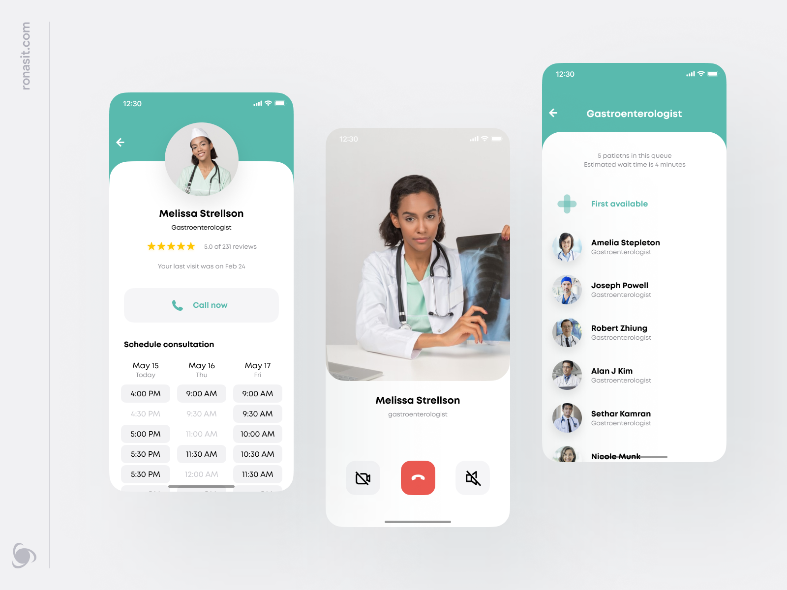
The first slide features three screens of the app – let’s take a look at them from left to right. First – a doctor’s profile screen with a video call button and a schedule of online consultations. Second – a video call screen. Third – a doctor search screen with a button that takes a user to the first available doctor. Such a great feature when there is no time to wait!
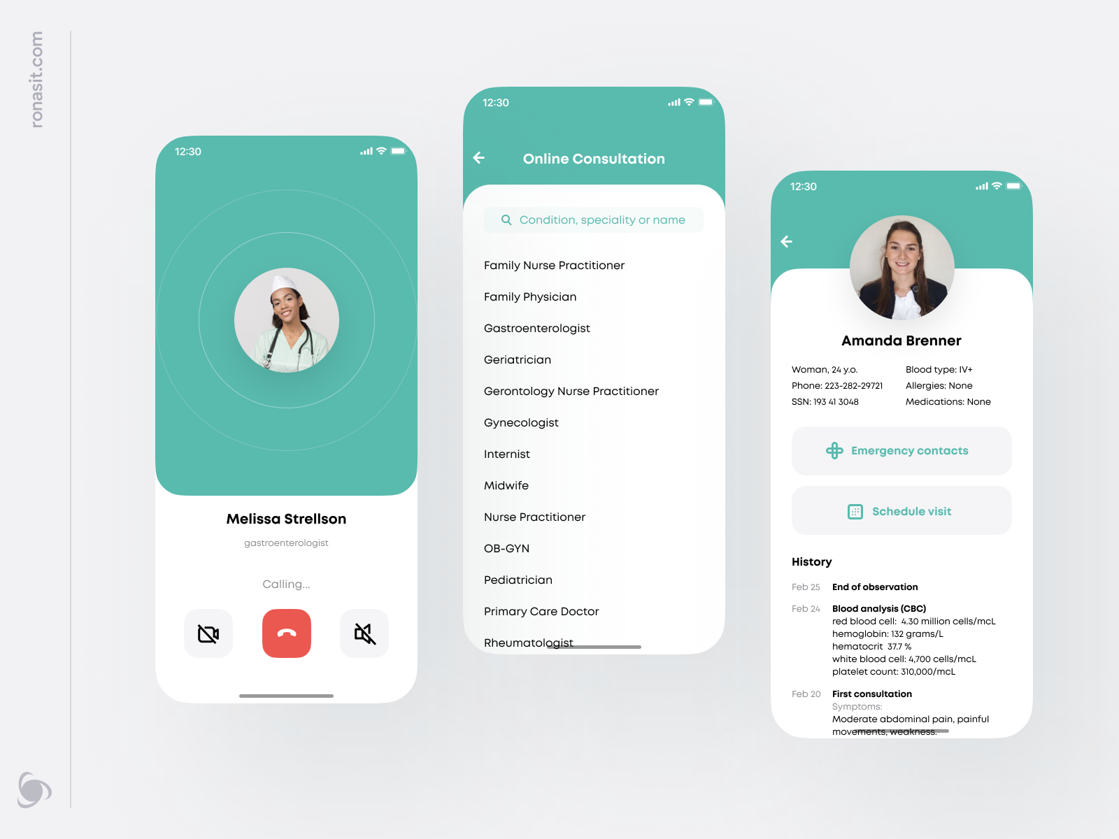
Now let’s explore the second slide. First, there is an outgoing call screen. In the middle, there is a search screen where a user can find a doctor by name, specialization, or symptoms. The last one is a patient’s profile with the main details and medical record.
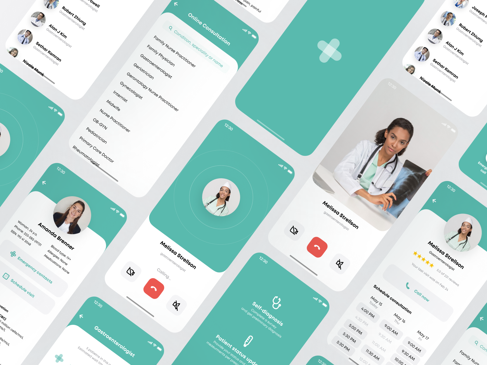
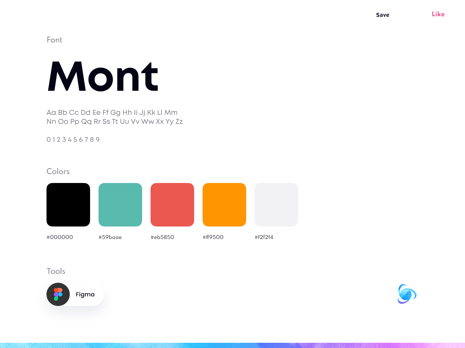
The main color of the app’s UI is one of the colors the healthcare industry relies on the most. In such a stress-filled environment, light and simple colors are more desirable for better patient experience.
What makes this app special? It was designed with a minimal number of swipes between screens. When there is an emergency, nobody’s got the time to figure out how to use an app.
Stay safe and healthy 💙
💌 Our team is available for new projects!
Just drop us a message. info@ronasit.com | Telegram | Facebook | Linkedin | Website


评论回复