💌 Have a project idea? We are available for new projects info@ronasit.com | Telegram | Facebook | Linkedin | Website
Today we’d like to share with you our design concept of a self-care app.
The app becomes a user’s buddy offering a personalized selection of guides and meditation mentors, mental therapy, and daily tasks. It helps to relieve before-bed anxiety, organize thoughts, and find peace of mind.
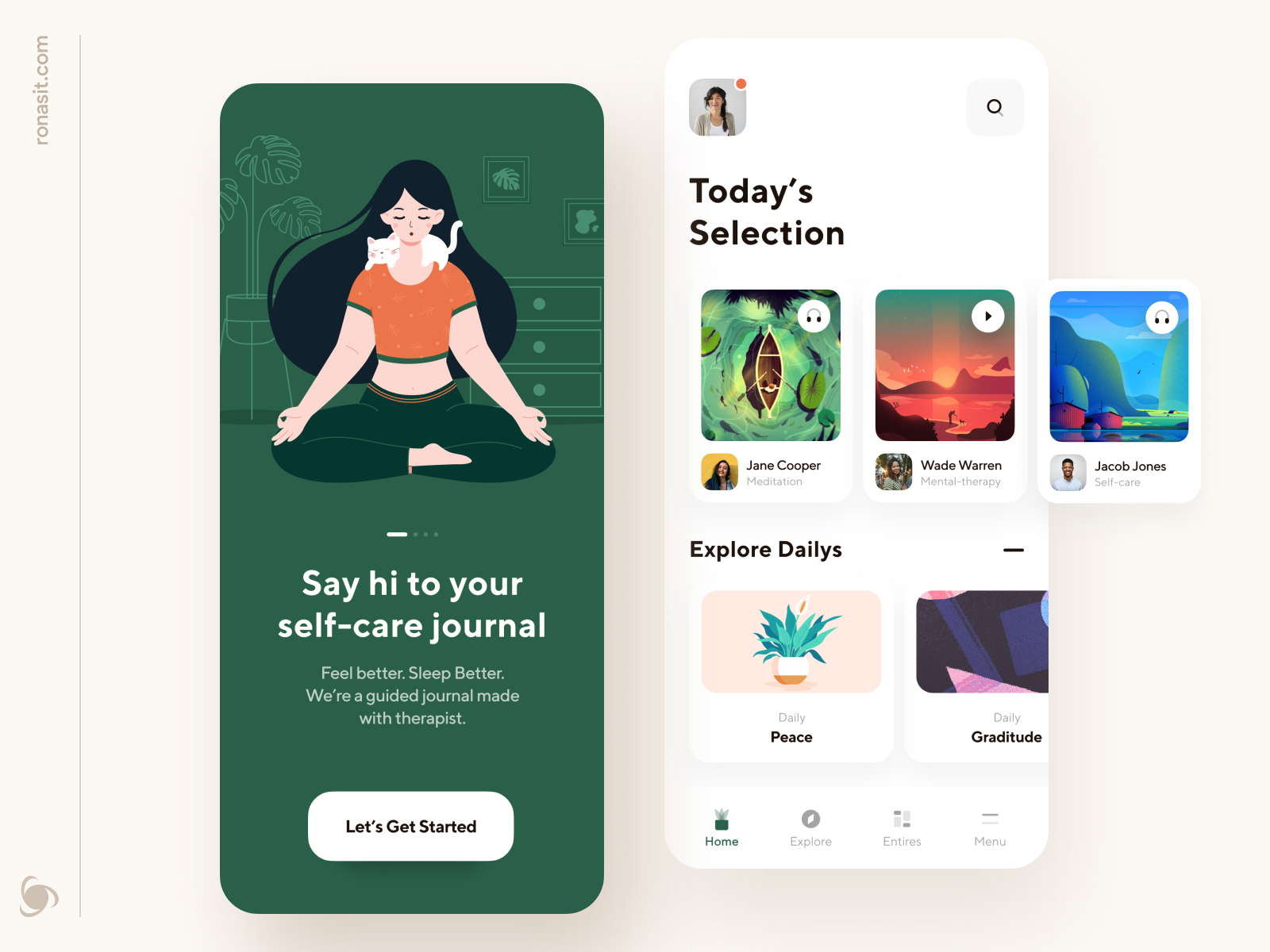
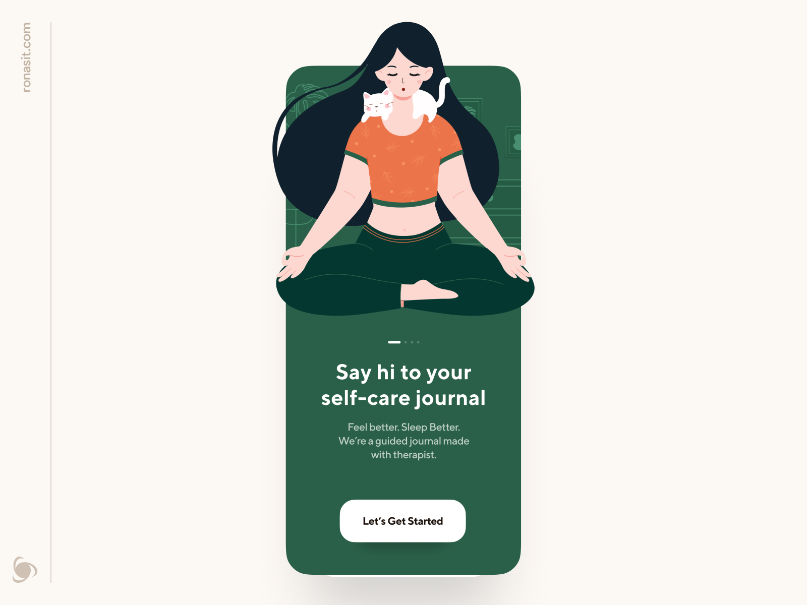
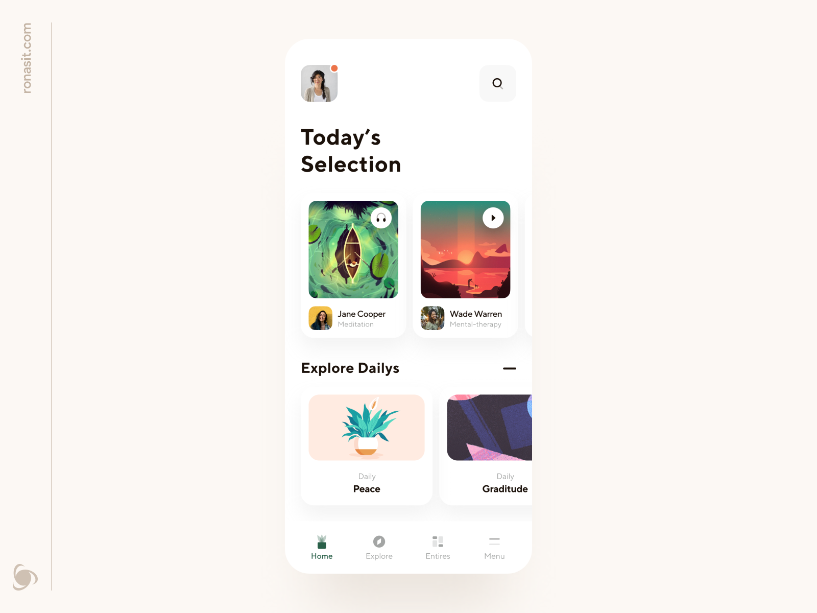
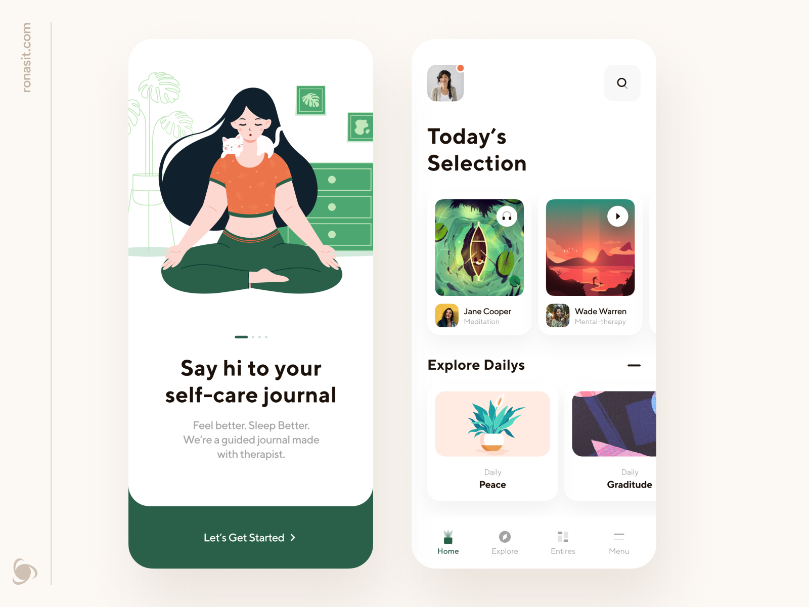
This shot features the app’s two main screens – onboarding and homepage. The onboarding screen walks a user through the app’s functionality with each swipe. For people who like to explore on their own, there is a button that takes them directly to the app.
The homepage hosts a daily selection of guides and tasks. Guides can be in video and audio formats to cater to both auditory and visual users. If today you know exactly what you need, just tap a search button at the top.
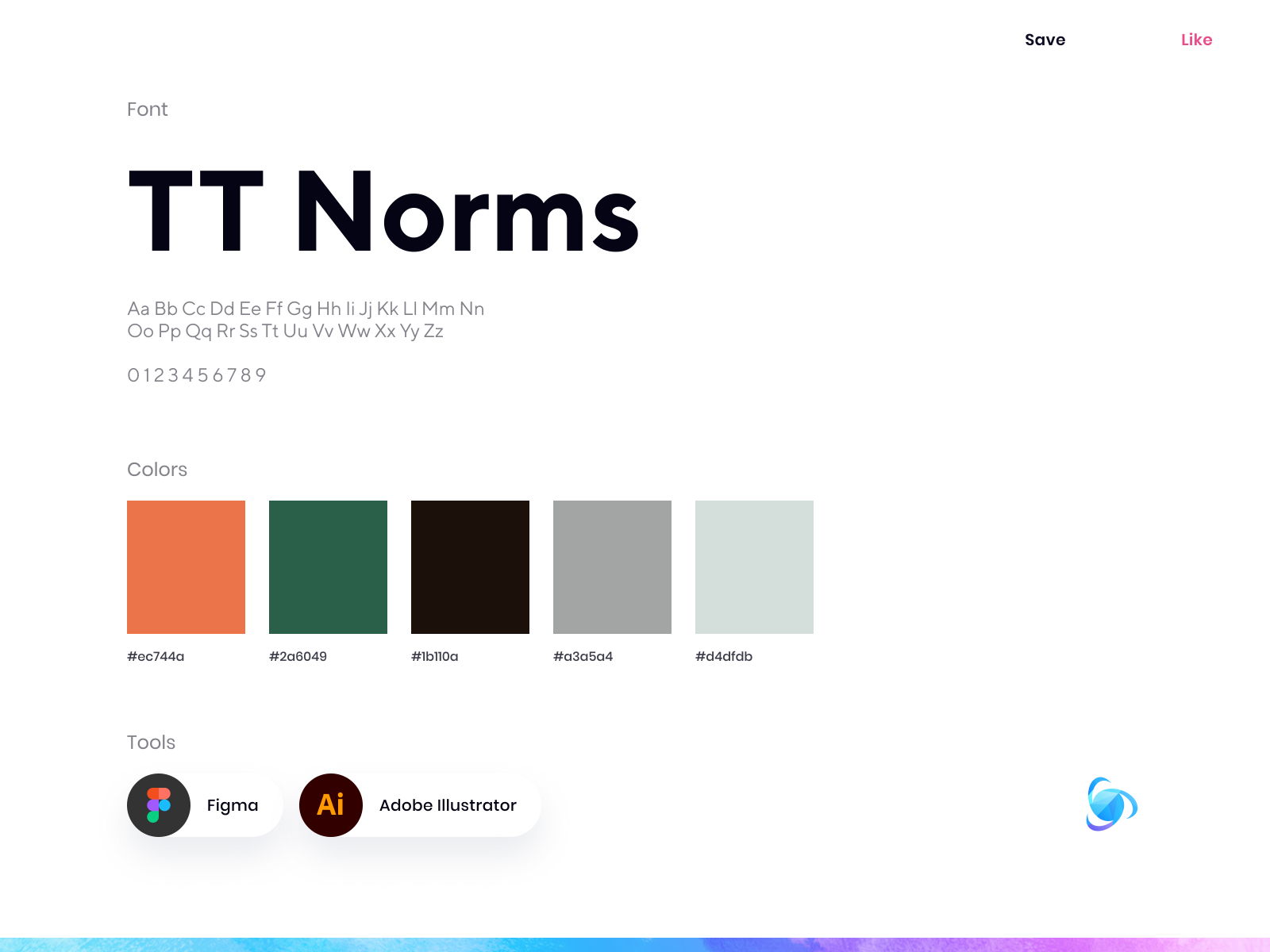
The main color of the interface is green – a restful and quiet color that attracts harmonious feelings. Green is used to highlight an active UI component. The general color palette is light. It helps users focus their attention on the content and relaxation and avoid any possible distractions.
What makes this app stand out? A fully personalized experience on a user’s self-care journey.
We can’t wait to hear your feedback in the comments!
>>访问dribbble查看高清大图


评论回复