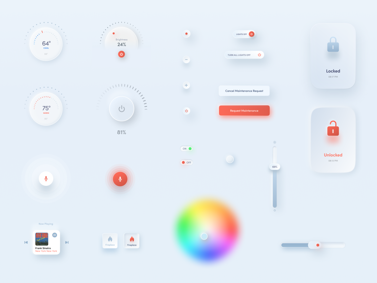
Quite a sloppy shot, no question, but the goal was to show a collection of UI elements, together with some different stylistic iterations here and there. I tried to stick to the trending neumorphic direction -as requested in the project brief – but at the same time lighten/personalize the interface styling and make it more development-friendly by using as less effects as possible. All part of an ongoing smart home/smart building SaaS mobile app. Made exclusively in Figma.
>>访问dribbble查看高清大图
做人要厚道,转载请注明文章来源:
https://www.boxui.com/ued/ui-design-ued/39653.html


评论回复