The team is available for new projects! Drop us a line: hello@purrweb.com | WhatsApp | Website
Hey-hey! This is how our team designed a platform that provides users with various online courses.
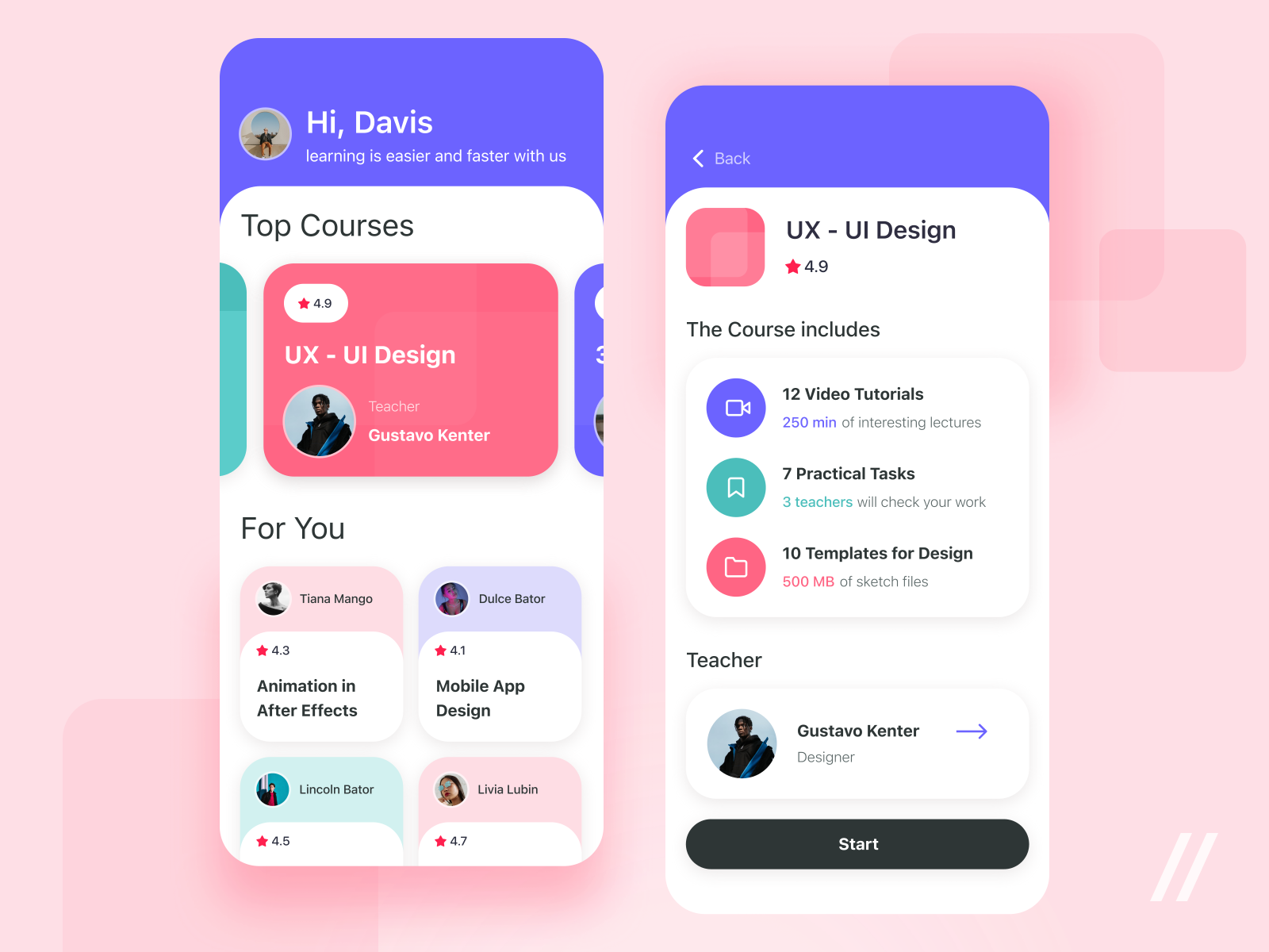
📲On the shot, you can see the user’s main screen. Here they can choose a course for themselves. Each card shows the course name, rate, and the teacher. To the right, there is the screen of a course that presents all content. As you can see, the user can go to a teacher’s account and start learning right from the page too.
🗓 The most popular courses are stressed with bright colors. This way, they attract more attention and motivate teachers to make their course more interesting and useful.
👩🏻🏫All courses are stored in one place. When the user passes one, they receive feedback from the teacher.
Created by Julia Vakulenko
Press L if you like this design and share feedback!
>>访问dribbble查看高清大图


评论回复