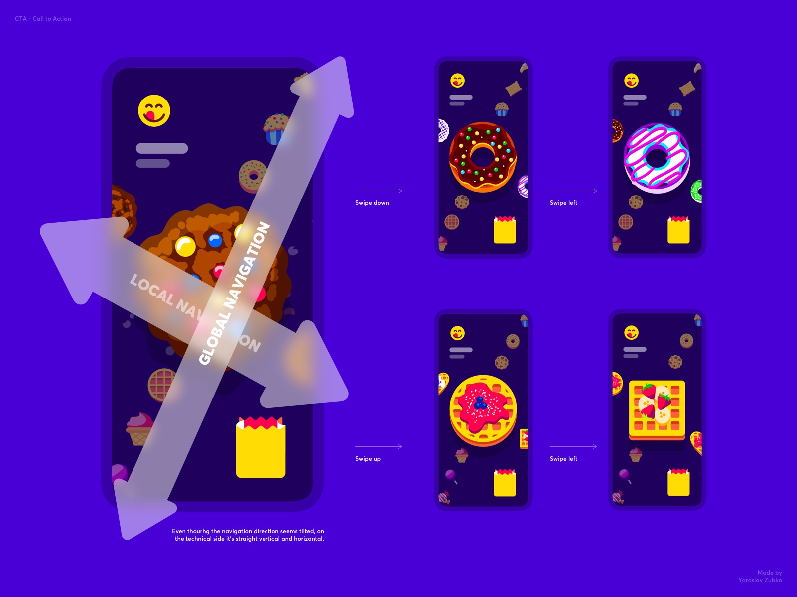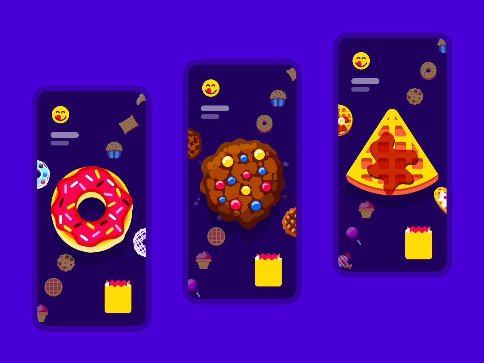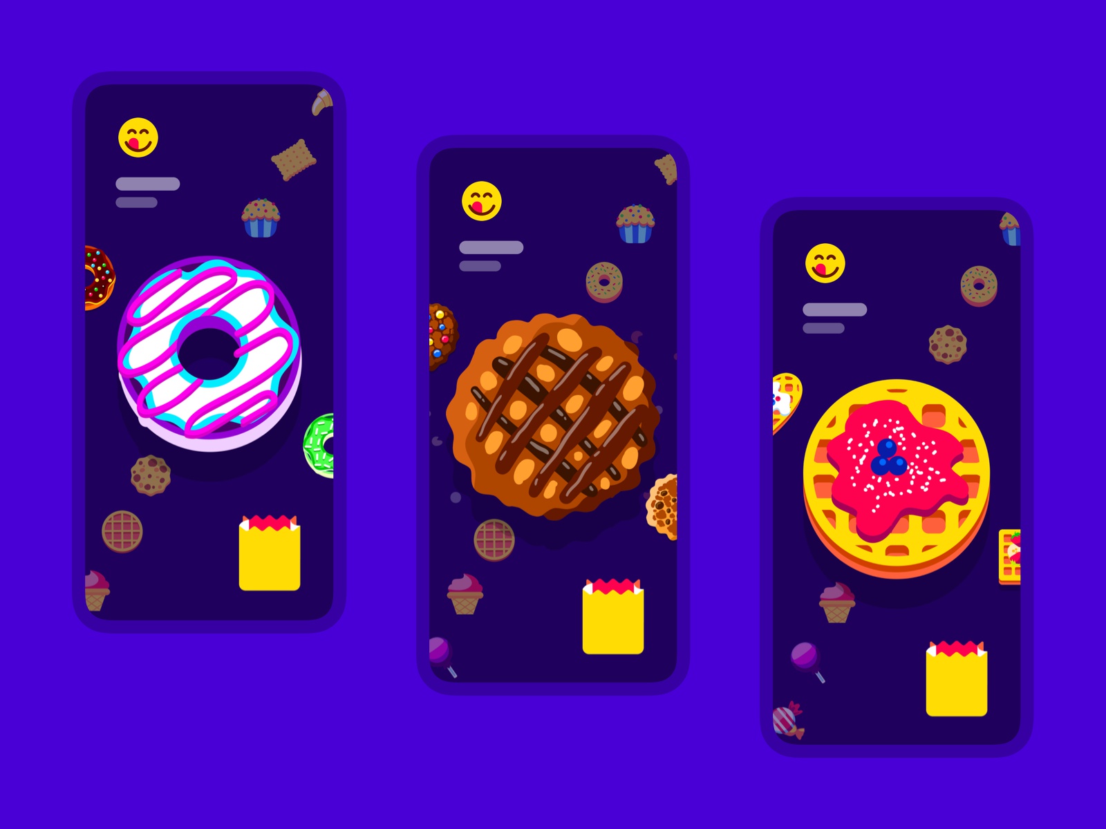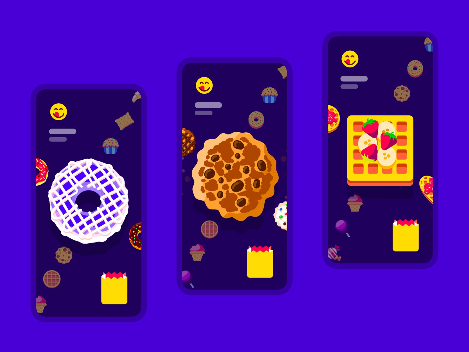


You might have noticed I’ve been loading tons of sugar on my account with all the sweets illustrations recently. Well, that’s why. Hope you like this interaction. I tested it on the phone and I have to say, despite my expectations, it felt really good.
Initially, I was concerned the diagonal direction might be confusing and there’s still a fine line between diagonal “fun” and diagonal “oh so which direction do I swipe!?” but this seemed pretty intuitive and pleasant to interact with. Check the second slide of the shot to check the real-time use.
This post is a part of my ongoing personal project, “Interaction Library” where I post interesting and engaging human-machine interactions. All posts are tested for accessibility on a real device and are proven to be possible to build.
Reach out for any design and/or development work.
>>访问dribbble查看高清大图


评论回复