Hello guys!
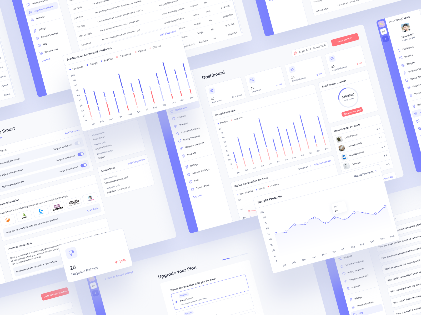
Today shot it is a redesign of an existing mobile application for e-commerce. Thanks to the app, online stores can manage and control reviews from their clients. After thorough research and a UX audit, it was possible to identify the most problematic areas of the application that require improvement. One of the changes introduced to the application was the introduction of a global filter to the menu, which allowed users to conveniently and quickly switch between accounts of their stores. The next step was to redesign the information architecture and organize the content of individual tabs. The names of tabs, sections, and signatures of individual elements have also been changed. All the functions in the application have been rethought, and those that turned out to bring no business value to users have been liquidated. Additionally, the app has also been completely redesigned visually while keeping its main pink accent.
Here you can view the app live.
Let me know if you like it. Press “L” if you do!
Want to see more projects? Visit our profile and remember to follow us!


评论回复