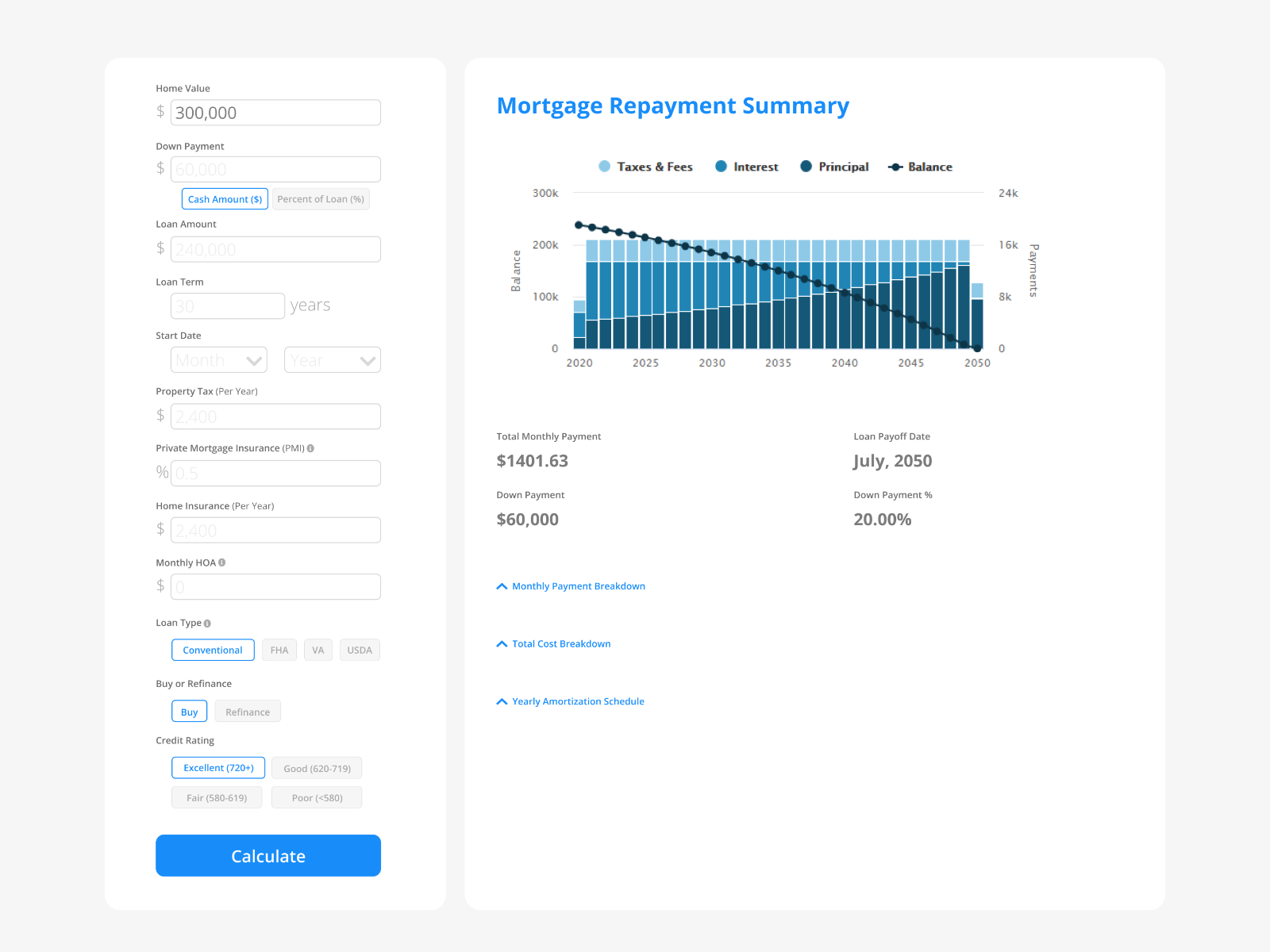
Daily UI Challenge #004. Partial redesign of www.mortgagecalculator.org. I love using this tool, just some added some user experience improvements by eliminating dropdowns and updating the user interface. Dropdown fields have been replaced with text radio buttons. Text radio buttons are much more clear to users. They show exactly which option they are selecting and don’t hide the information as a traditional drop-down menu would.
Prompt: Design a calculator. Standard, scientific, or specialty calculator for something such as a mortgage? Is it for a phone, a tablet, a web app?
Try Yourself: https://www.dailyui.co/
>>访问dribbble查看高清大图
做人要厚道,转载请注明文章来源:
https://www.boxui.com/ued/ui-design-ued/41643.html


评论回复