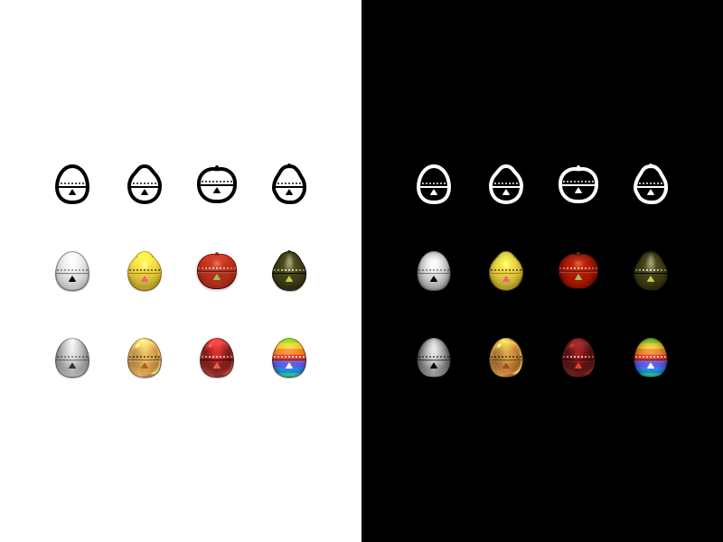

We’ve taken a look at our recipe UI and decided the timer should move into the navigation bar. In order to remain legible at such a small size, I’ve redrawn them.
My initial thought was that they had to go flat, and that resulted in top row of icons. Eventually I decided that lost too much character, and realized the enhanced details of the flat icons could be married with the detailed version of the timers.
Have a look at the second shot for actual size (@2x).
>>访问dribbble查看高清大图
做人要厚道,转载请注明文章来源:
https://www.boxui.com/ued/ui-design-ued/41788.html


评论回复