
💌 Have a project idea? We are available for new projects info@ronasit.com | Telegram | Facebook | Linkedin | Website
As we are mostly stuck in our homes, the crucial role of food delivery apps became obvious in the lives of today’s food consumers. That’s why we decided to experiment and create our own design concept. And here is the result!
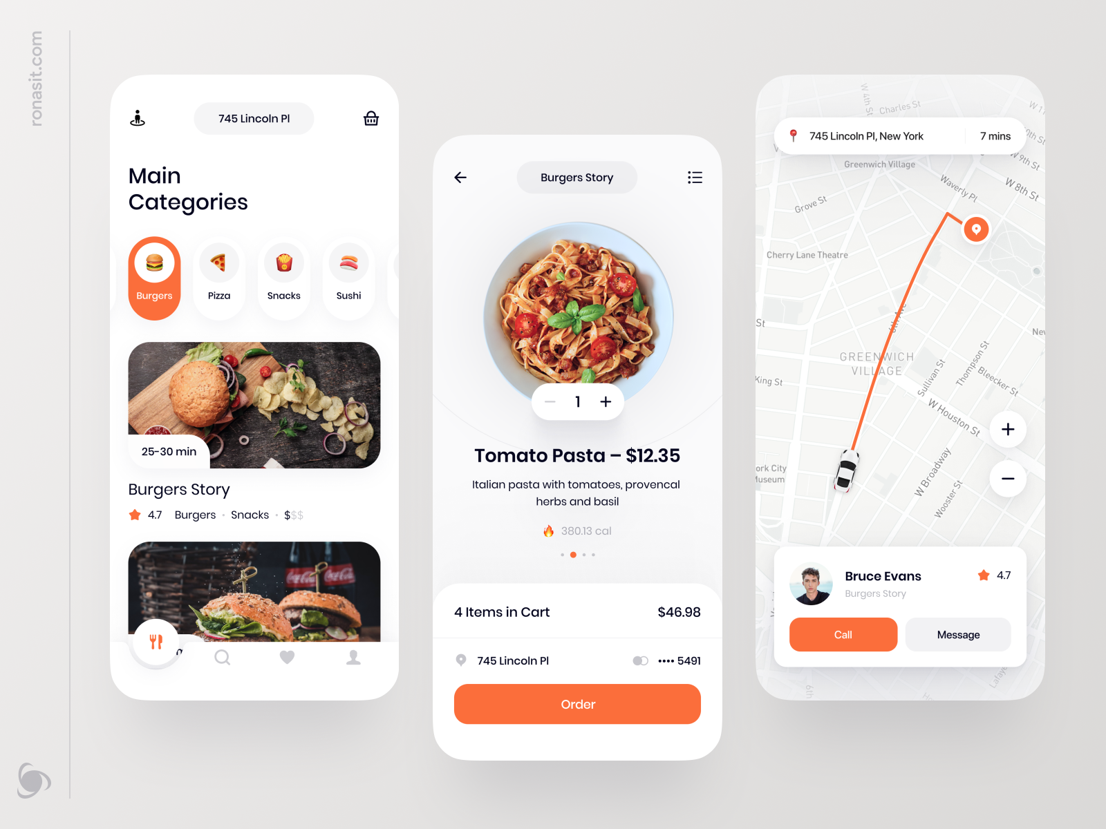
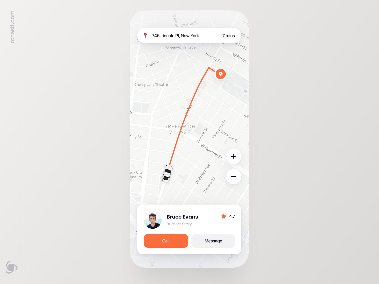
This app doesn’t only offer its standard functionality — choosing a restaurant, adding your favorite dishes to the cart, and making an order. It also lets you keep track of where your delivery driver is and get in touch with them if needed.
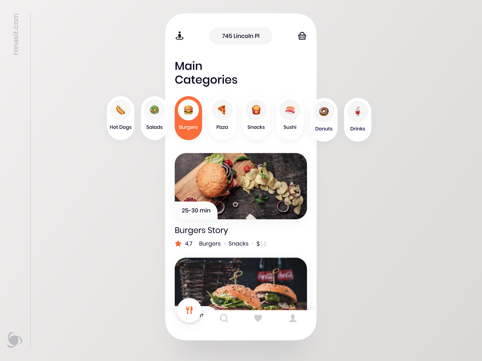
The shot features three main screens. The first one is search results screen with a user’s location field on the top and app navigation at the bottom. The second — a cart with selected items. Calories displayed under each dish help to make rational choices. The last screen is a map view with a delivery driver card that gives you two options to reach them.
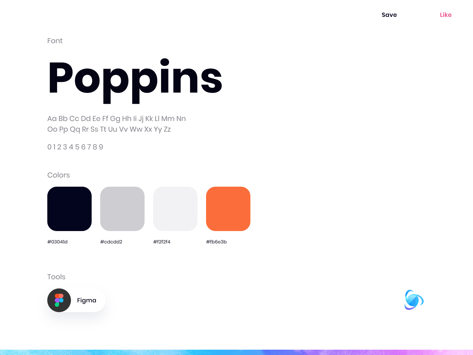
The interface is minimalistic and light with orange as the main color. Cheerful and friendly orange is used for highlighting chosen elements and CTA buttons.
Now let’s confess — how many times did you use any food delivery app in the last couple of months?
>>访问dribbble查看高清大图


评论回复