💌 Have a project idea? We are available for new projects info@ronasit.com | Telegram | Facebook | Linkedin | Website
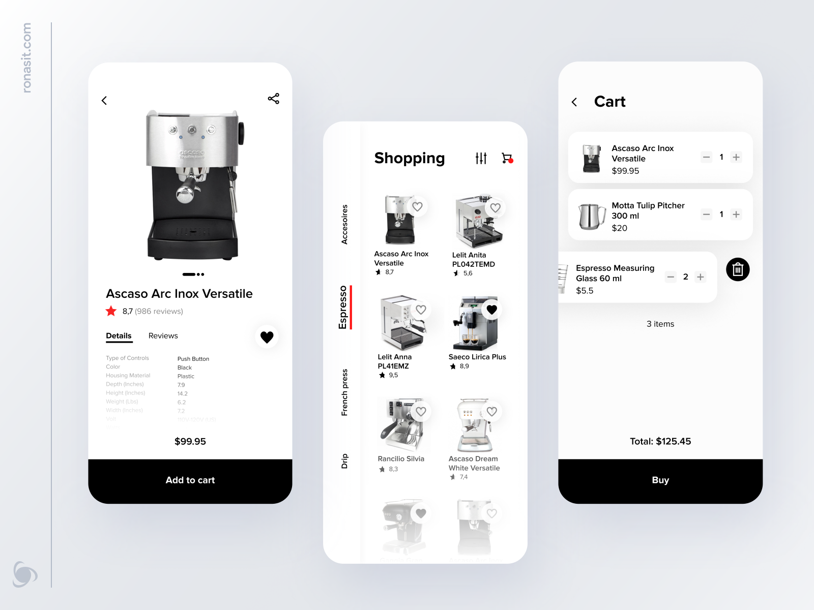
Meet our new design concept of an e-commerce app for coffee lovers. Users can explore and buy coffee machines and related products.
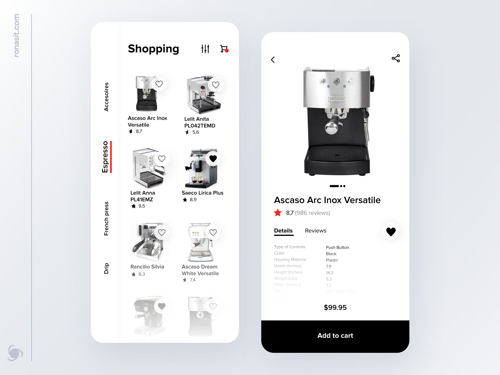
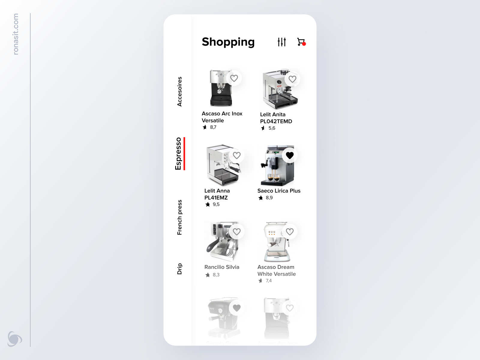
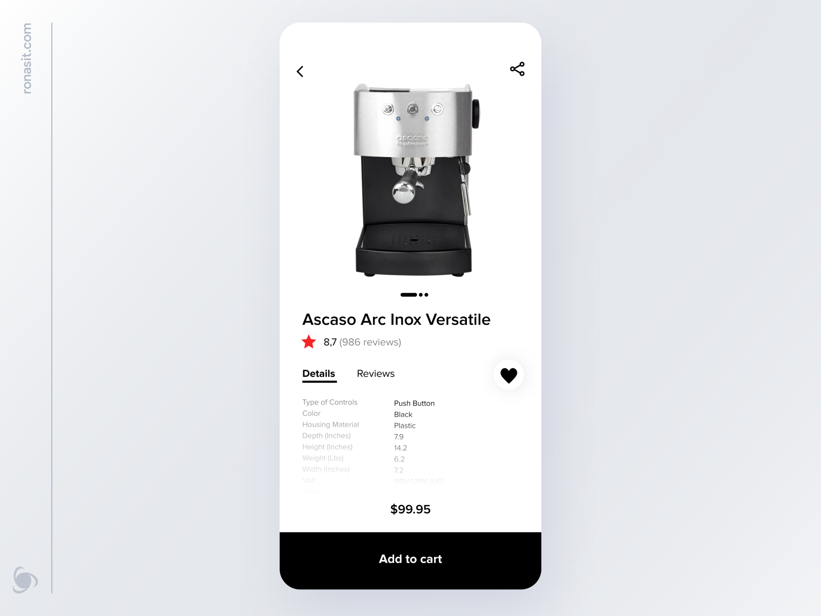
The first slide of this Dribbble shot features two main screens of the app. On the left there is is a product search screen and on the right – a screen with a chosen product and its details.
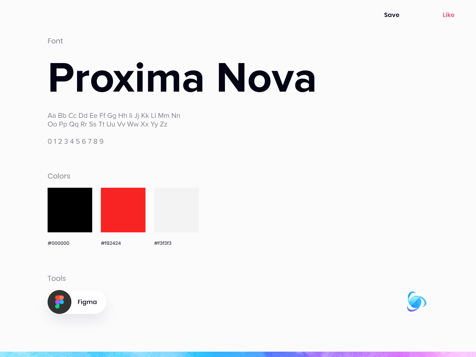
The black-and-white user interface is minimalistic and laconic. However, the red-colored elements add dynamics and highlight certain parts of the UI.
Unusual sidebar navigation on a search screen makes the user interface unconventional and special.
>>访问dribbble查看高清大图
做人要厚道,转载请注明文章来源:
https://www.boxui.com/ued/ui-design-ued/42296.html


评论回复