

Hi there people,
Like many of us, we’ve worked on a bunch of medical projects in recent months. Obviously due to the whole situation, a lot of companies and products moved toward the healthcare sector.
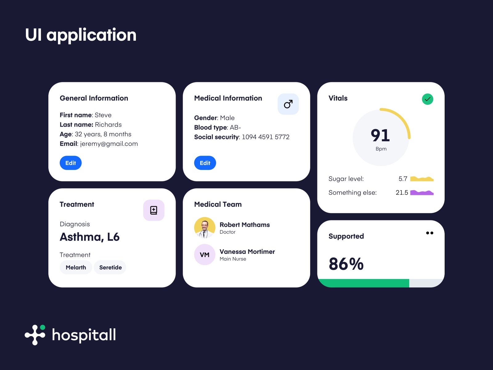
This is part o a project that we actually didn’t finish, and had to end early. I thought that myself and Stefan did a really nice job in structuring the dashboard environment hence I’m sharing some of the visuals here.
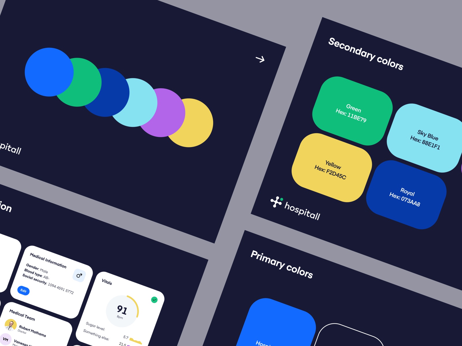
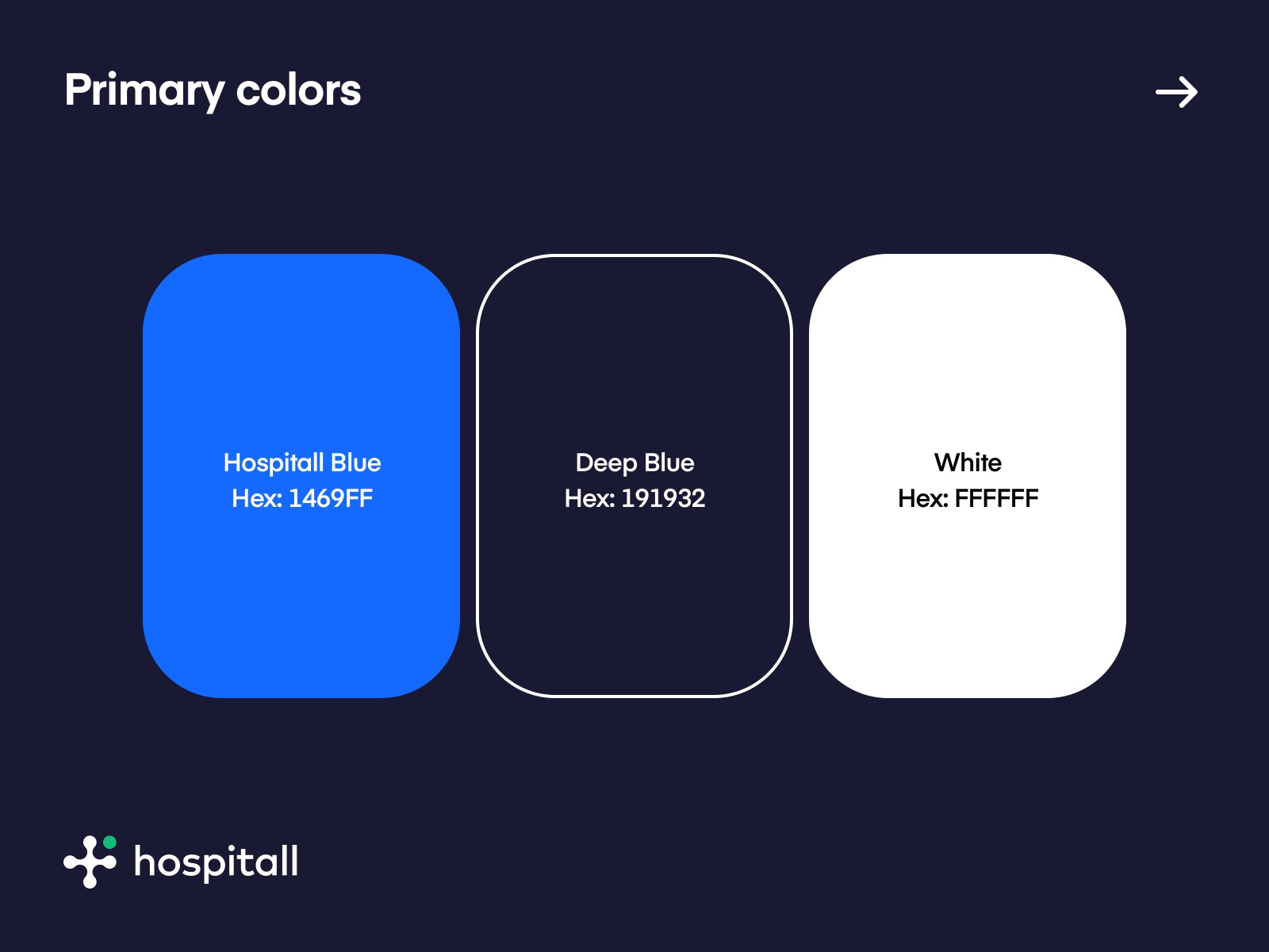
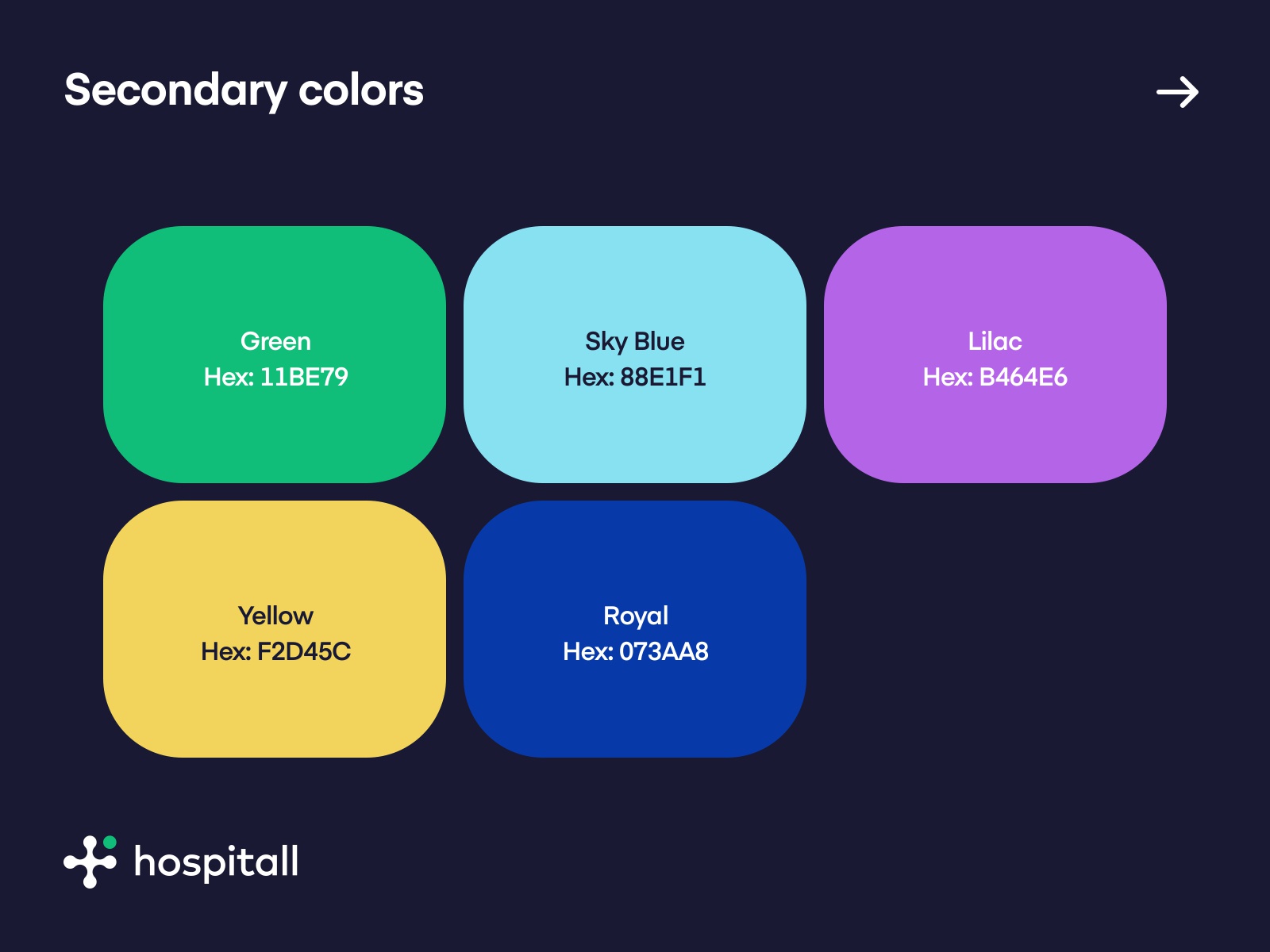
Here we are showcasing one of four different color explorations we created for the project. Personally, this was the best option as it tied down the brand and color use-case perfectly. The colors were impactful, yet contrasting and not over saturated to offer nice readability within a data-heavy environment.
Best, Filip
>>访问dribbble查看高清大图


评论回复