

The team is available for new projects! Drop us a line: hello@purrweb.com | WhatsApp | Website
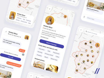
Hello, Dribbblers! Check out our new shot — tenant app! The app allows users to communicate with future neighbours on various topics before moving to a new house🏠: schools, noise, mud, problems of the neighbourhood
On the shot you see: 🗺 A map of chosen neighbourhood with the marks of potential talkers 🗒 A profile of selected talker, where you can see personal information and have the opportunity to write a message 🗯 A chat with a potential neighbour including sharing links and personal calls
💜 The accent colour is purple — it helps users to concentrate and contrasts with other selected colours 🧡 The second accent colour is orange — makes users feel comfortable to communicate and creates a friendly atmosphere. 💛 Additional yellow — awakes in people positive attitude to the talker 🦄 Light purple was added to create a relaxing atmosphere and to conduct the conversation.
There is a convenient search for people who are ready to communicate and talk about their neighbourhood🏙
Press ❤️ if you like our design and share feedback! P.S. If you want to gain insight into UI/UX design trends, check out our article!
Created by Alexandra Bessonova
>>访问dribbble查看高清大图


评论回复