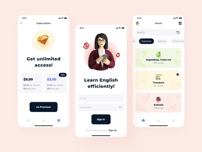
Hey all! How easy and fun is it to learn English? Off – with this application, it’s as easy as shelling pears as it gets, yet effective. In this application, I used the most cracking emoji and 3D illustrations to attract the primary target audience of the client – teenagers and 20+. Look for a clean and neat design. And UX is even more intuitive than it was before. The redesign worked very well. I’m still working on the design, but I couldn’t help showing you the three main screens. What do you think?
Design — Figma
************ 💌 I am open to new projects! hey@migulko.cz ************
Instagram | Linkedin | AE+Sketch templates
>>访问dribbble查看高清大图
做人要厚道,转载请注明文章来源:
https://www.boxui.com/ued/ui-design-ued/48986.html


评论回复