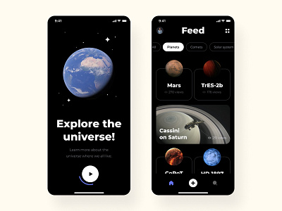
Hey all, No, I’m not a fan of conspiracy theory. I love the Universe for its infinity and greatness. I love to learn new and unknown. I recently worked with a client on an application for a school to study planets, space, and all the cosmic bodies that we now know. Wow. I don’t know that we already know so much. What about UI? Look at this UX; everything is convenient and straightforward – switching between tabs and saving everything you have already learned from the application. As for me, everything is in balance here, and colors and typography and visuals. The problem was that Apps for schoolchildren do not all look cool, and children do not want to learn new material in a boring way. I changed this approach. I asked my nephew during the work what else needs to be done. And when he said, “Awesome, where can I download it?” I realized that this application has turned out precisely as the Gen Z generation wants to see it. Now you take a look and tell me, what else would you add?
Design — Figma
************ 💌 I am open to new projects! hey@migulko.cz ************
Instagram | Linkedin | AE+Sketch templates
>>访问dribbble查看高清大图


评论回复