
💌 Have a project idea? We are available for new projects info@ronasit.com | Telegram | WhatsApp | Facebook | Linkedin | Website
Today we’re coming to you with a delivery app concept. Our idea was to create an aggregator that offers local transportation services in one place so that users don’t have to think about what company they’re hiring – they just open this app.
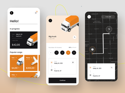
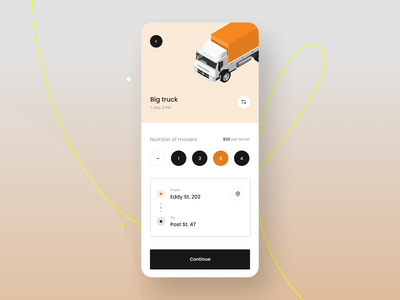
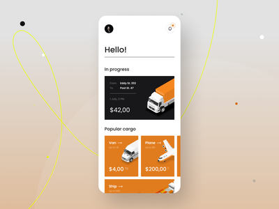
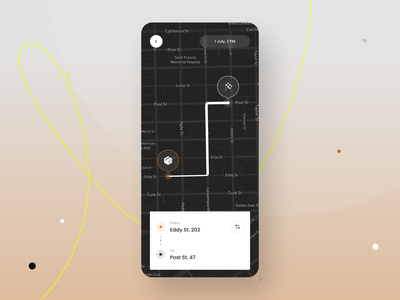
The shot shows three screens: a home page with the delivery in progress and popular transportation options; a truck order page; and a map with the itinerary shown.
We’ve picked a neutral black and white color palette and added orange as an accent to make the interface look more vibrant. This design solution is a proven trick on how to create a simple yet eye-catching design.
We’ve designed this concept to make the shipping experience easier for our users. The app offers a range of customizable services to pick from and keeps the user’s experience on point due to a well-thought flow.
>>访问dribbble查看高清大图


评论回复