

Let’s share a minimal Design. Here i am doing the With Black and White first time,
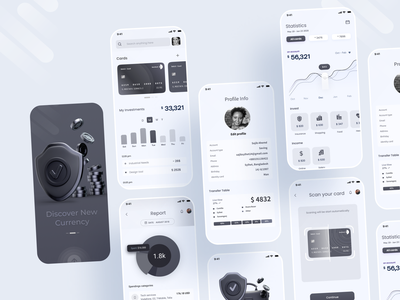
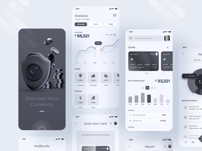
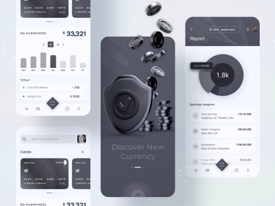
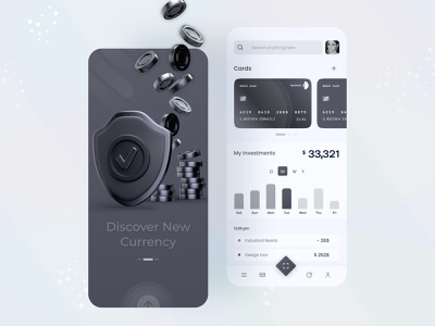
1st screen is normally Splash screen, Please pop up to go next screen
From the 2nd screen, first let’s start search something then see your cards, also you can add card. You can see your investment by Day, Month, Weeks, Year
Though i make a mistake in design. I keep it Month selected instead of Day
Then you can see this day transaction
Let’s Start the 3rd screen under 2nd screen , This is report screen and first you will see a pie.and then you see the spending categories
4th Screen is profile screen . You can update your information and also add or delete your card
5th screen under 4th, It is Just a pop-up screen when you send any amount sucessfully then it will show with a pop-up
6th screen is your transferring statistic. you can also see your incom and invest history
by 7th screen you can scan your card and you can easily use it, add it
That’s enough for today
—————————————————-
Any Project Inquiry?
📩 Contact us if you need any custom UI/UX design Services.
🤝 Say Hello: sylgraph.agency@gmail.com / facebook / Instagram / Linkedin
>>访问dribbble查看高清大图


评论回复