
Hey all,
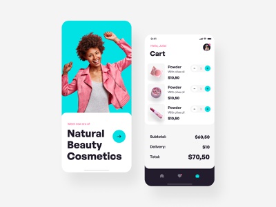
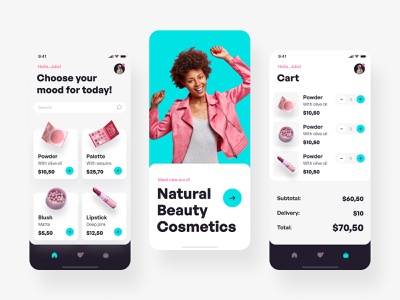
Putting together a beautiful and striking design is not easy, especially when working in a women’s cosmetics store. In this direction, clients usually collect referents in pastel and closer to natural shades. It was kind of a challenge for me to design in 2 primary colors and add black as a backing to display contrast and bring out vibrant colors.Overall, I really enjoyed working on this project as well as the final result; The only thing that worries me is that if you change the main Photo, you will lose this delicate and unbreakable balance among shades and harmony. What do you think? Your suggestions are important to me, and it will be great to know your opinion.And as always, don’t forget to put “L” — this will make the world a little kinder ^^
Design — Figma
Motion — Afer Effects
************
💌 I am open to new projects! hey@migulko.cz
************
Instagram | Linkedin | UI8
>>访问dribbble查看高清大图


评论回复