
Hello dribbble! 👋
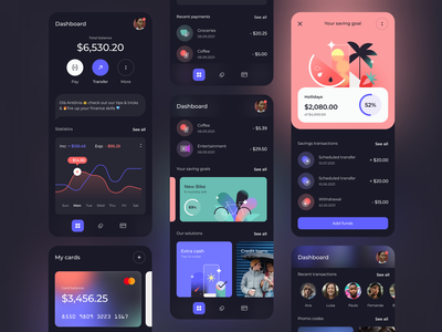
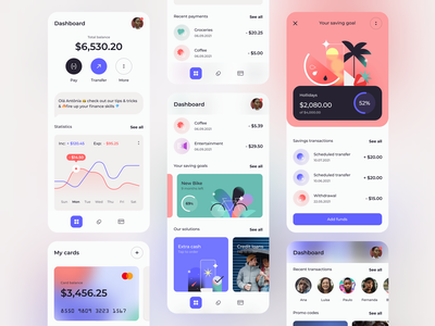
Here to share this concept for a banking app 💸 that lets users save money for specific goals, get extra cash in emergencies and gives tips & tricks on how to grow one’s financial skills.
To create the look & feel of the product I explored the dark vs light mode together with neons & pastels pallet and played with some geometric illustrations including glassmorphism effect.
Thanks for stopping by! 🌹
We’re available for new projects! Drop us a line at illustration@netguru.com.
—
Show us love! Press “L”.
Want to see more projects? Visit our profile or Netguru.com and remember to follow us!
>>访问dribbble查看高清大图
做人要厚道,转载请注明文章来源:
https://www.boxui.com/ued/ui-design-ued/57763.html


评论回复